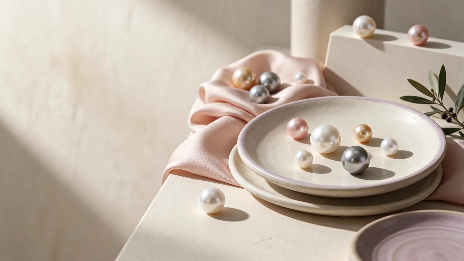
How do color and length affect the neckline balance of an orange pearl necklace, an orange freshwater pearl strand or an orange pearl strand necklace? — Flint Jewelry styling guide
Start with an outfit, not a shade name. Put on a top you wear often and decide whether the necklace should blend into its warm colors or provide a distinct accent. Cream can create a gentle background, while navy can make orange more noticeable. Look at the full area around your face and shoulders. A strand that dominates a close-up might look balanced in the mirror, or the reverse, depending on the neckline and surrounding details.
Test the resting point with the neckline you actually plan to wear. A crew neck gives you a chance to compare a necklace above the fabric edge with one lying entirely on the top; an open collar adds moving edges that may interrupt the line. For a foundation in strand proportions, consider the single strand pearl necklace guide. Check the arrangement while sitting and turning your head, rather than choosing a length solely because it looks good in a still image.
Before choosing an orange pearl necklace, how can different lighting help you assess an orange freshwater pearl strand or an orange pearl strand necklace? — Flint Jewelry styling guide
View the strand by a window without direct sun, then move to the indoor lighting used in your daily routine. Keep your clothes and the background consistent so the comparison is useful. Note shifts toward yellow or red and changes in apparent intensity. A phone can record the look, but its white balance and filters may alter the color.
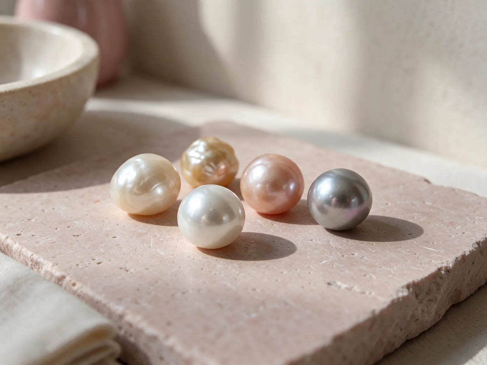
Decide between a quiet warm accent and a brighter statement
The word orange leaves room for many visual impressions. You might describe a tone as apricot-like, earthy or vivid to explain your preference, but those descriptions do not establish pearl type or quality. Try the color with a white shirt, a neutral sweater and a dark jacket. If a softer direction integrates with your wardrobe, that is a practical benefit; if a stronger orange makes familiar clothes feel more expressive, that may be your preferred result.
Consider whether the entire strand should read as one warm color or show intentional color variation. A multicolor pearl necklace offers another styling direction when you enjoy a changing rhythm. Look at the central area and both sides, first laid out and then worn, to see how the arrangement reads. Do not assume that more color variation makes a strand better or worse. Judge whether it complements your clothes without competing with their patterns and other jewelry.
Let a direct comparison matter more than complexion formulas
Hold a muted warm orange and a brighter orange near your face with the same top. Notice which contrast you enjoy and which one feels easier to wear repeatedly. You do not need a fixed rule assigning certain colors to certain complexions. Your own response to the complete outfit is a more useful styling test.
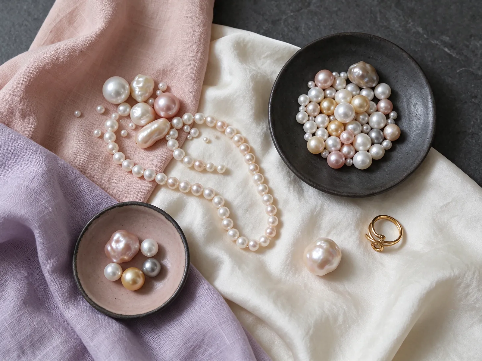
Ask different questions about color, pearl identity and structure
An orange pearl strand necklace is a description of a look, not a complete statement about the pearls. Color alone does not establish freshwater or saltwater identity, natural or cultured status, or treatment history. When considering an orange freshwater pearl strand, ask how its identity is described, then ask separately about color treatment. Keep these questions distinct so a pleasing color description does not get mistaken for information it cannot provide.
Structure is another separate topic. The nucleated freshwater pearl necklace guide can help you frame a structural question, but an orange appearance does not prove nucleation and a photograph does not establish nacre measurements. During comparisons, make one list of visual preferences and another of the information you want explained. Similar names may describe visually similar strands without giving you equivalent identity, treatment or structural details, so compare the actual explanations rather than the names alone.
Distinguish the main color from additional surface effects
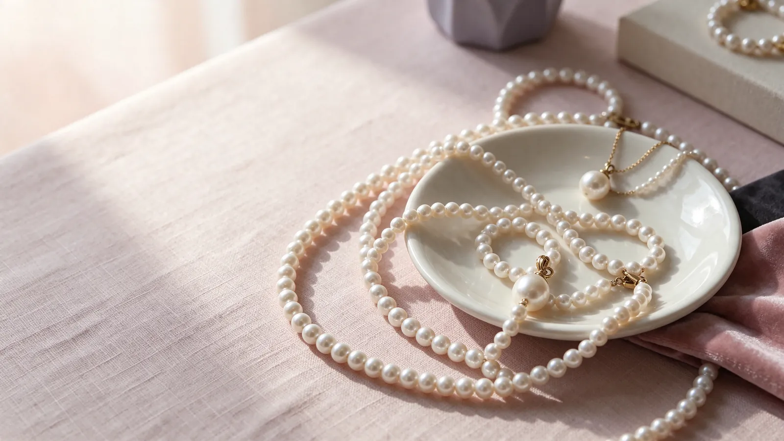
GIA distinguishes bodycolor, overtone and orient. Bodycolor is the dominant overall color, overtone is a translucent color over it, and orient is a shimmer of rainbow colors on or just below the surface. All pearls have bodycolor, but only some show overtone, orient or both. Describe the main color first, then any additional color impression. A bright reflection is not automatically orient. Record changes while rotating the strand as observations, not conclusions about identity or treatment.
Compare the complete strand, not just its most vivid pearl
Once you like the color, shift your attention to the rest of the necklace. Observe how the luster reads across the strand under consistent lighting, then look at surface appearance and the arrangement of shapes. A uniform-looking line and a varied line create different styles. If variation appeals to you, check whether it is arranged in a way you enjoy. The full necklace will be worn as a composition, so one attractive close-up should not decide the entire comparison.
GIA lists seven pearl value factors: size, shape, color, luster, surface quality, nacre quality and matching. This framework helps you remember questions that color can overshadow; it does not make every factor measurable from a picture. For document reading, explore the pearl necklace with GIA report guide. GIA says pearl reports provide identity, formation-environment and treatment information, with details depending on the chosen service. Check which pearls the report describes. Another strand with a similar orange appearance cannot borrow its conclusions.
Alternate between detail views and an ordinary mirror view
Use a close view for surface questions and a normal mirror distance for balance with clothing. If glare conceals a detail, try a clearer angle instead of assuming brightness answers the quality question. Conversely, a magnified detail may not tell you how the overall strand feels in an outfit. Each view has a different purpose.
Build work, casual and evening looks around one clear focal point
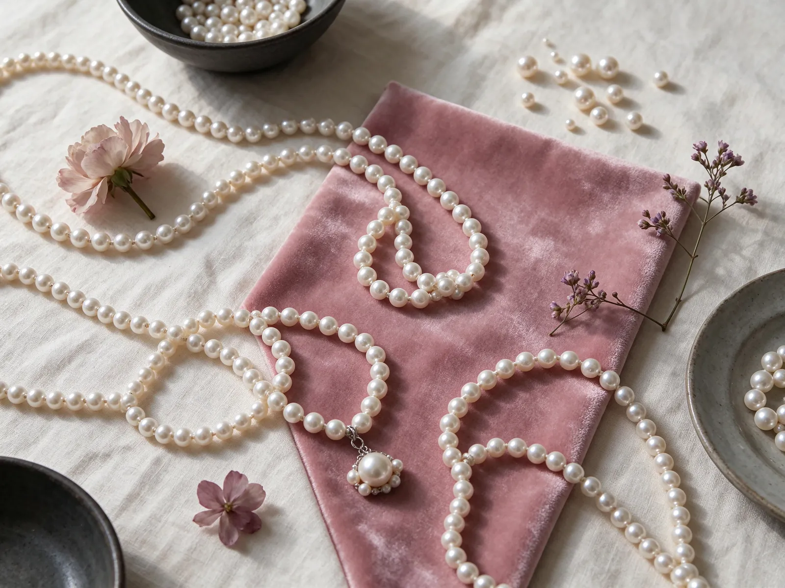
For work, begin with a plain neckline and let the orange strand provide the main warm accent. Then assess earrings, jacket buttons and collar details together so they do not compete unintentionally. A casual outfit can use denim or a simple knit as a background. Rather than assigning a fixed pearl size to either setting, compare the relationship between the necklace line, the texture of the clothes and the amount of visual detail around your face.
For an evening outfit in a dark color, test the necklace alone before adding more accessories. Orange can stand out without requiring every other piece of jewelry to be equally strong. If your preference turns out to be more muted, compare the palette ideas in the gray Akoya pearl necklace topic. A gray direction and a warm orange direction can change the same top in different ways. That comparison concerns styling only; it does not identify pearl type from a visible color.
Use patterned clothing as a color cue rather than a matching demand
If a print contains a small orange element, the strand can echo it without matching exactly. Check whether the necklace still has a clear line at the neckline. When the pattern and pearls blend together too much, try a plain outer layer or a different resting position. Adding more orange is not necessarily the solution.
Make comfort and care part of the styling test
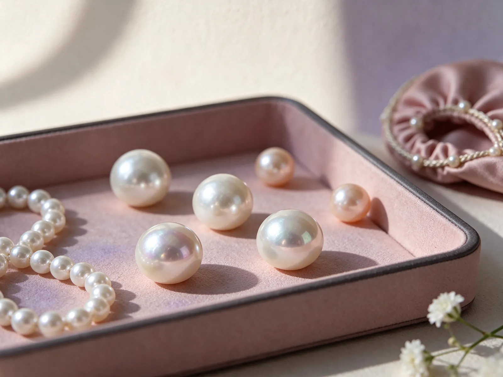
Try a few ordinary movements before settling on the look. Sit, turn your head and raise your arms gently to see whether the strand meets a collar, button or another necklace. With a high neck, observe whether the fabric supports the line naturally or pushes it aside. If you have long hair, let it fall around the clasp during the test. Comfort and convenience are personal observations that a styled photograph cannot reliably answer for you.
GIA places pearl at 2.5 on the Mohs hardness scale and says pearls should never be cleaned with ultrasonic or steam cleaners. Use a very soft clean cloth after wearing and keep the strand apart from items that could scratch it. Avoid acids, perfume, hair spray and excessive heat. Orange appearance does not provide a permanent-color guarantee or change these general care principles. Consider whether this care routine fits your habits, alongside the outfit possibilities.
Do not wear a water-cleaned strand while its string is still damp
GIA advises that the string must be completely dry before wearing strung pearls that have been cleaned with water. Surface dryness alone does not tell you whether the string has dried. Avoid high heat as a shortcut, and follow clear care instructions for the particular strand when treatment or stringing details call for specific handling.
Create a buying brief based on real outfits and clear information
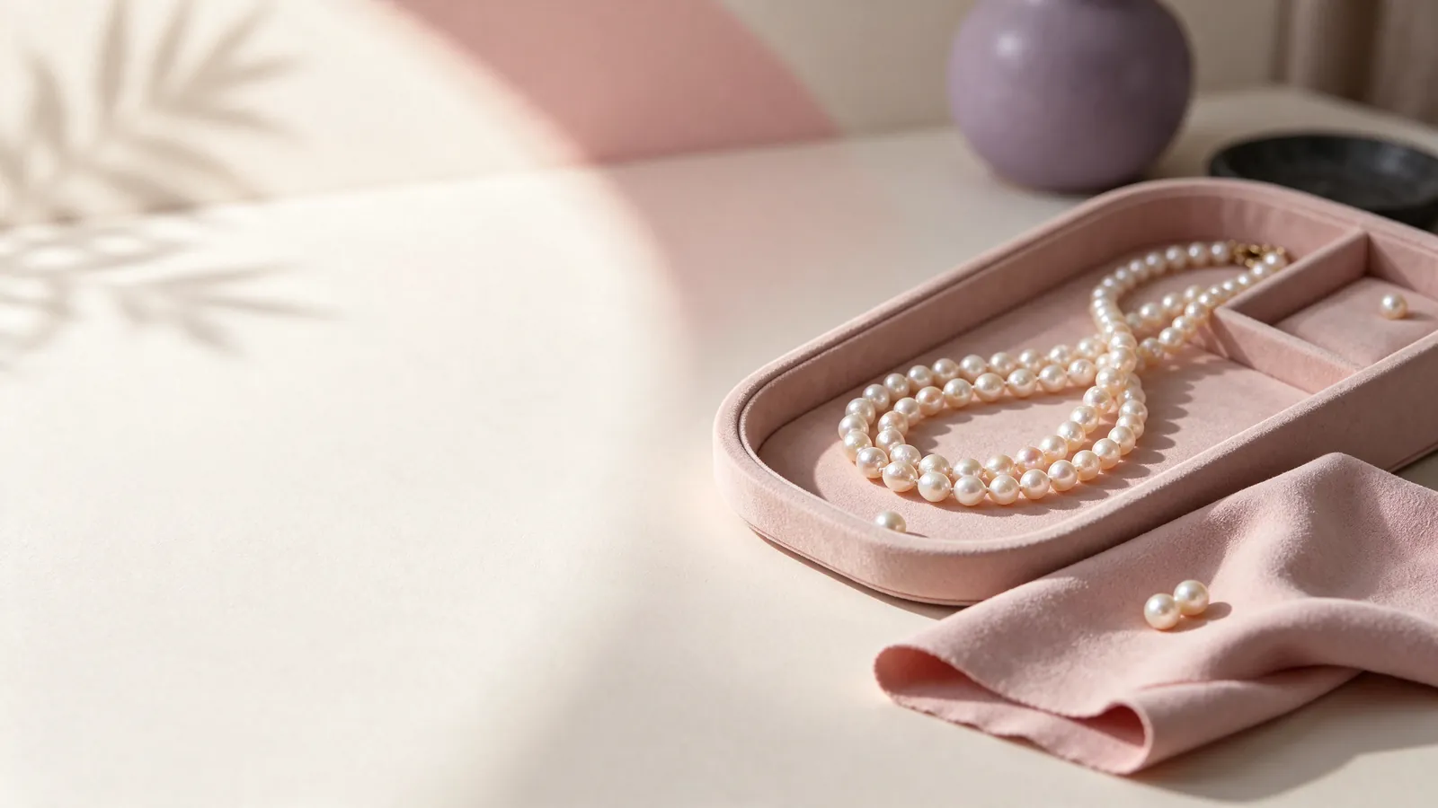
Write down the necklines you use most, the place you want the strand to rest and how much orange you want to see. Test a work outfit and a casual outfit rather than trying to imagine every possible occasion. Notes such as stronger contrast with navy or a clearer line above a crew neck make later comparisons easier. General praise like beautiful is less useful when the next image has different lighting, a different model and a different background.
Before deciding, separate the appeal of the look from the information behind it. You may enjoy the color and arrangement while still wanting a clearer explanation of identity, treatment or care. For a gift, ask about the recipient's usual colors and necklines instead of assuming an orange strand fits every wardrobe. A good buying brief says why the style works for a person and what factual information matters to them. A clear explanation of the pearls matters more than a dramatic description of rarity.
Keep online inspiration separate from specifications it cannot show
Use online images to shortlist color directions and outfit ideas. Keep unanswered questions about real fit, lighting and treatment in a separate list. An editorial image is not evidence of current stock, pearl identity or dimensions. Pictures can suggest a style; clear product information and appropriate documents must answer the factual questions that pictures leave open.
Want to turn your warm-color preferences into a clearer styling direction? Contact Flint Jewelry on WhatsApp at +85260106207 with your usual neckline, clothing colors and preferred resting point. Talk through the role you want a pearl necklace to play in your wardrobe. If you already have a strand in mind, include its description and the questions you want to ask about pearl identity, color treatment and care.
| Focus | Subtle approach | Bold approach | How to compare | What to ask |
|---|---|---|---|---|
| Warm color | Blend with cream or ivory | Create contrast with navy | Keep the same top and background | Color description and treatment details |
| Resting point | A quiet continuous curve | A visible accent at the neckline | Check both sitting and standing | Actual length and clasp information |
| Whole strand | An even visual impression | Intentional variation | View laid out and while worn | Shape and matching description |
| Images | Watch for washed-out color | Watch for enhanced saturation | Compare daylight and indoor light | Identity separately from appearance |
| Care | Use a very soft clean cloth | Avoid aggressive cleaning for bright color | Store apart from scratching items | Treatment and stringing care |
Pearl knowledge and authoritative references
GIA lists seven pearl value factors: size, shape, color, luster, surface quality, nacre quality and matching. An orange color preference should be considered alongside the other factors.
Read the reference for this factFrequently asked questions
Does an orange shade indicate a particular pearl identity?
No. Orange describes visible color, not freshwater or saltwater identity, natural or cultured status, or treatment history. Ask about those details separately and compare clear descriptions rather than drawing conclusions from the shade.
Why might an orange strand look different at home than in an image?
Lighting, the surrounding background and camera processing can affect the apparent color. Compare the strand in indirect daylight and your usual indoor lighting with the same clothes. A filtered image should not be your only color reference.
Should a first orange pearl necklace be muted or bright?
Either can work. Test both against familiar outfits and decide how much contrast you enjoy. A muted tone may integrate quietly, while a brighter one may become the main accent; neither choice needs to follow a rigid complexion rule.
Can I judge a full necklace from the best-looking pearl in a close-up?
A close-up helps with detail questions but does not show the complete arrangement. Also view the whole strand and its balance with clothing, then ask about the relevant quality factors and identity information that an image cannot establish.
How do I keep an orange strand visible against a busy print?
Try a clearer neckline area, a plain outer layer or a different resting point. The strand can echo one small orange element without matching the print exactly. Check the overall line before adding more same-color accessories.
Updated: