
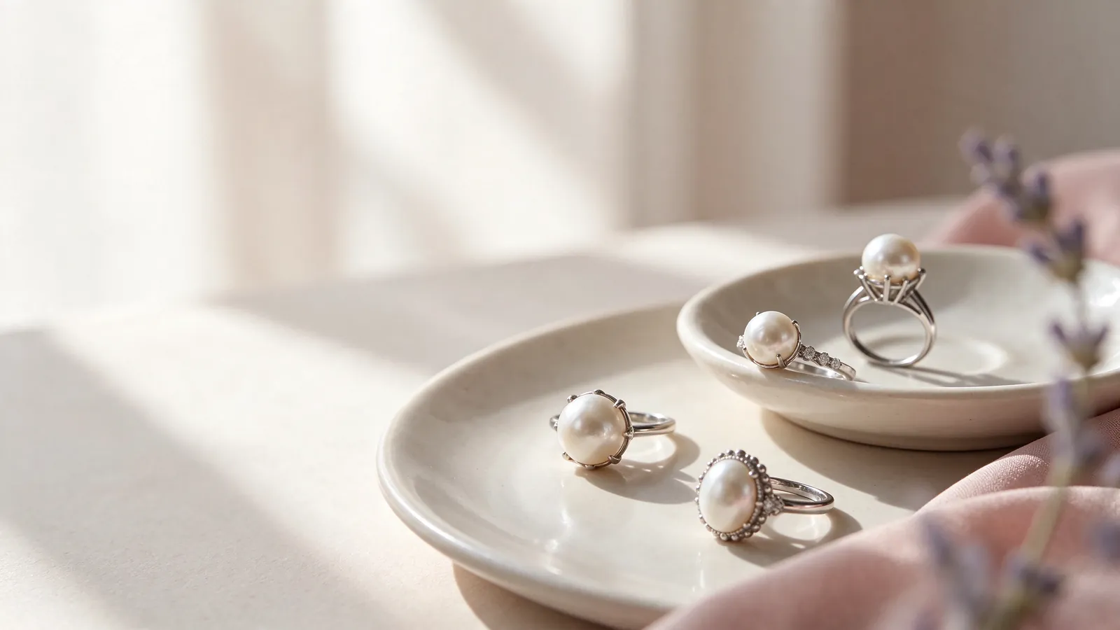
How would you pair an 18K gold pearl ring with everyday jewelry: a white gold pearl ring or a rose gold pearl ring?
Begin with the pieces that already earn a place in your routine. Your everyday watch, favorite earrings and most-worn ring reveal more about your preferences than a styled occasion photo. A white gold pearl ring can reinforce a white-metal palette; a rose gold pearl ring can become a warm accent against a neutral outfit. Neither is automatically right for a particular complexion. Decide whether you want continuity with familiar accessories or a visible change in the way your hand is styled.
Make the comparison with your hand beside a normal sleeve and watch. Notice whether the pearl, the band or another accessory dominates, and whether that emphasis is what you want. A strong watch may work better with fewer competing ring details, while a simple watch can leave room for a more noticeable band. The pearl solitaire ring guide can help you consider a pearl-centered focal point, then connect the band with other pieces you wear instead of choosing each item as if it will always be worn alone.
For an 18K gold pearl ring, how do band width and fit shape the look and feel of a white gold pearl ring or a rose gold pearl ring?
Band width changes both the visual share of the metal and the way the ring touches the finger. A wider outline may become part of the focal point, while a finer band can keep attention on the pearl. During a fitting, extend your fingers, relax them and make a gentle fist. Check for pressure against adjacent fingers and repeated rotation toward the palm. A tighter size is not a universal solution when the setting's balance or the band profile is the real issue.
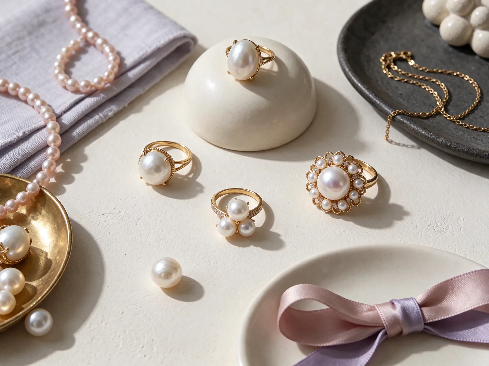
Read the full metal name when considering a white setting
18K 750 white gold is white gold, not platinum. PT950 and PT900 are separately identified platinum options, even though both material families can appear white in photographs. Do not let a color label replace the complete material description. If you are weighing white gold against platinum rather than choosing between warm and white tones, the platinum pearl ring guide addresses that related topic. Separate the material question from whether you simply like a particular band outline or setting profile.
In an outfit, a white band can connect the ring with white-metal earrings or a watch without making every piece identical. Consider how much visual detail surrounds the pearl and whether it remains easy to see as the main feature. Bright studio lighting can exaggerate the contrast between metal and background. Compare under ordinary lighting when possible, and do not assume that the most reflective photograph predicts how the ring will look throughout a normal day.
Make your description more precise than 'a white pearl ring'
State the metal and the visual preference separately: for example, 18K 750 white gold with a clean band and a pearl-centered look. Then explain whether you like a setting close to the finger or plan to wear another ring beside it. 'White pearl ring' can leave both the pearl color and the metal unresolved. A reference image is most helpful when you identify the curve, proportion or visual balance you like rather than asking for every feature to be reproduced.
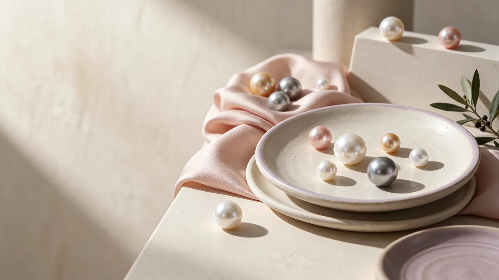
Treat warm gold tones and pearl color as two different choices
18K 750 yellow gold can repeat the warmth of existing accessories or stand out beside navy and cream clothing. 18K 750 rose gold is another warm direction that may suit a softer accent within a neutral wardrobe. Ask whether the ring should introduce warmth or extend a color already present. To judge that fairly, compare with similar backgrounds and lighting; a warmer photograph does not necessarily show a warmer pearl or a more suitable design.
A rose gold setting does not require a pink pearl, and the metal cannot identify a pearl's variety. If your interest is specifically in the pearl's pink or lavender appearance, explore the pink freshwater pearl ring guide as a separate topic. Start with the pearl's own appearance, then consider the effect of bringing a warm band alongside it. This avoids mistaking the influence of metal, fabric or photographic color for an inherent feature of the pearl.
Use familiar lighting to test whether the combination appeals to you
View the pearl first against a neutral background, then alongside the chosen metal and an everyday sleeve. Check both daylight and the indoor lighting you commonly use. A ring does not need to look identical in every environment, but you should like the combination in the places you will wear it. Avoid treating one warm-toned image as proof of a particular overtone or making the whole decision from an unusually colorful background.
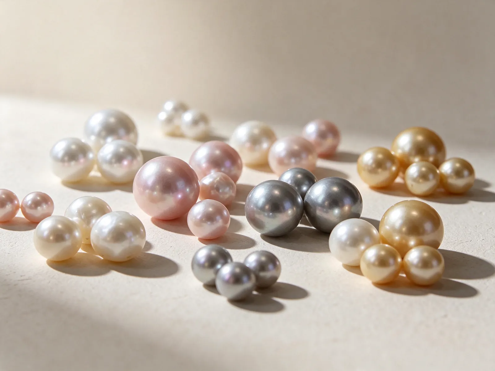
Evaluate the pearl beyond the impression created by its setting
GIA lists seven pearl quality factors: size, shape, color, luster, surface quality, nacre quality and matching for jewelry with more than one pearl. Use them to organize your observations rather than judging the ring only by which metal looks more luxurious. Look at the luster that attracts you, the relationship between pearl outline and band, and the visible surface within the overall design. These factors explain pearl assessment; listing them does not establish a certificate or grade for an individual pearl.
Color has its own distinctions. Bodycolor, overtone and orient are separate components, and a pearl does not necessarily display all three. A warm setting may alter the impression of the pairing without proving anything about the pearl's identity. Neither shape nor color alone establishes origin or natural-versus-cultured status. When those questions are important, use the description or documentation tied to the individual pearl, not a conclusion drawn from a jewelry photograph.
Compare the top view with the side profile
A pearl's visible spread across the hand is only one aspect of proportion. The setting's height and outline matter when the ring sits near a cuff or another band. If you like a broad pearl-focused appearance, the mabé pearl ring guide offers a related design subject. A seemingly shallow image cannot establish a pearl type, diameter or finished setting height. Keep the look you prefer separate from specifications that a photograph cannot supply.
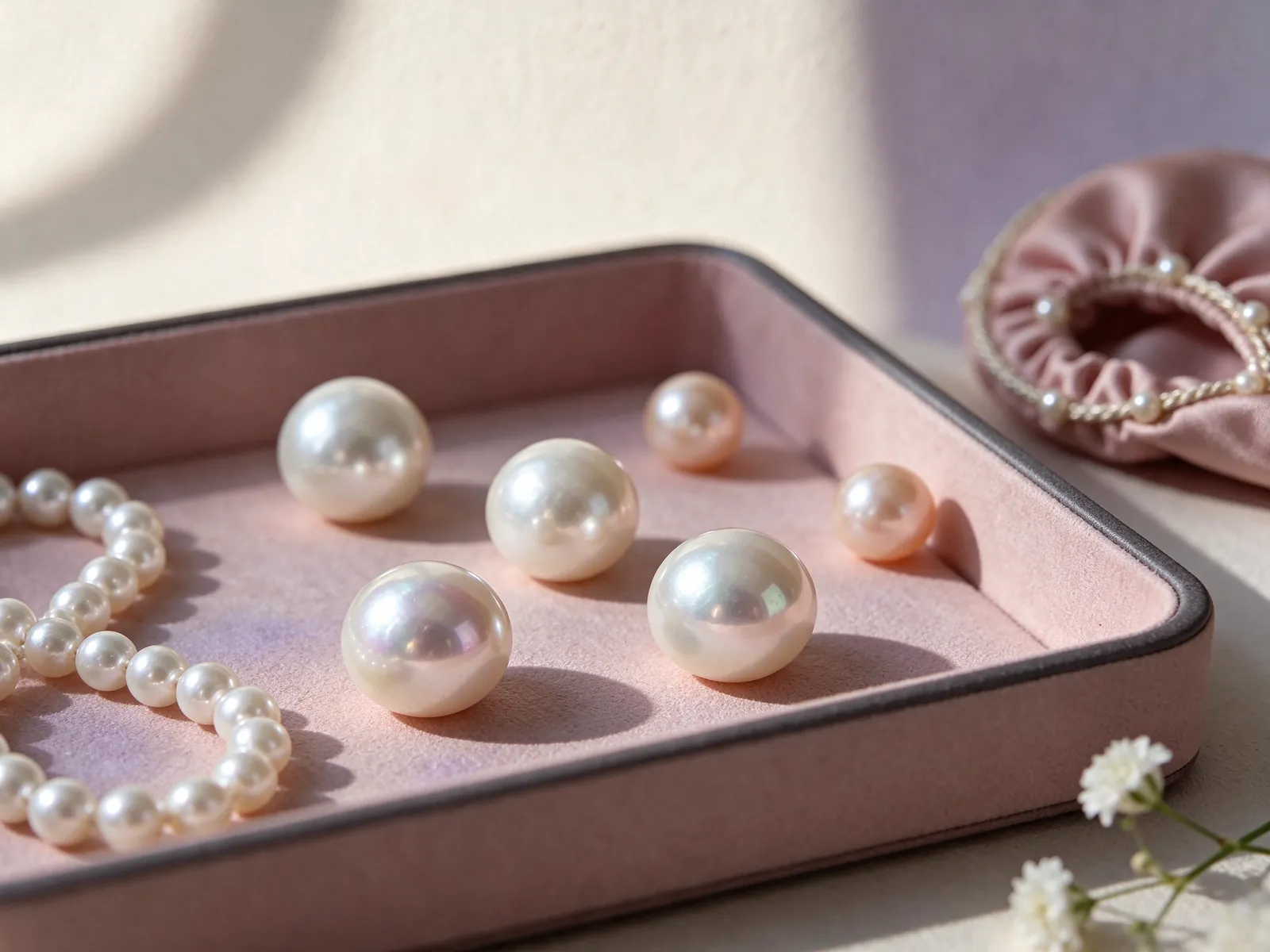
Use ring size as a starting point, then assess real fit
A wearable fit must work at both the knuckle and the base of the finger. Reducing a size to stop movement at the base may create a problem when taking the ring off. The guide on how to measure ring size explains how to gather useful information, but a paper strip does not duplicate every band width or inner contour. Note the finger you intend to use and the method behind the measurement rather than presenting the number without context.
Try normal hand movements and notice rotation, pressure or interference with neighboring fingers. The condition of your fingers can vary with time and activity, so consider whether the fitting reflects your usual wearing situation. If you plan to stack rings, assess the pair together. Two bands occupy space differently from a single band, and their contact may affect movement. Neither a very tight fit nor a ring that slides easily is automatically the right result.
Identify the system before converting a size number
Do not assume a Japanese ring number is equivalent to the same US number. Japanese to US ring size conversion helps explain the difference between systems. Retain the original number and sizing system, plus any known internal circumference or diameter. A conversion does not solve differences in band width or setting balance. If an existing ring is your reference, explain which finger it fits and whether you consider that fit comfortable, loose or tight.
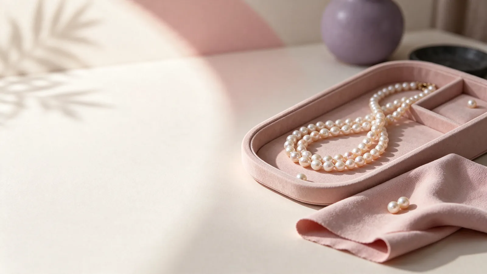
Build outfits and stacks around how the ring occupies space
For everyday workwear, think about your sleeves and routine movements before focusing on the most dramatic design. A structured cuff may meet a raised setting, while loose knitwear can catch on exposed details. A white band can echo cooler colors, and yellow or rose gold can provide a warm accent in a neutral outfit. Those styling choices do not establish that a ring will suit every task; its profile and the ways you use your hands matter just as much.
For an evening outfit, let the pearl ring carry the main emphasis and decide which accessory will support it. You might repeat its metal tone in earrings or a watch while keeping other jewelry simpler. Mixed metals can also work when one tone clearly leads. If the arrangement feels busy, remove a competing piece before adding more details. Aim for a combination that makes sense with clothing you actually own, not only with a single carefully staged outfit.
Inspect the contact between stacked rings
Look from the side to see whether a neighboring band reaches the pearl or pushes the setting. Try a relaxed hand position and gentle movement without forcing the rings into a tight stack. Separate fingers can preserve the color relationship while avoiding unwanted contact. A complicated neighboring ring may pair more clearly with a simple pearl band, allowing the metal tones to connect the look while the outlines retain space.
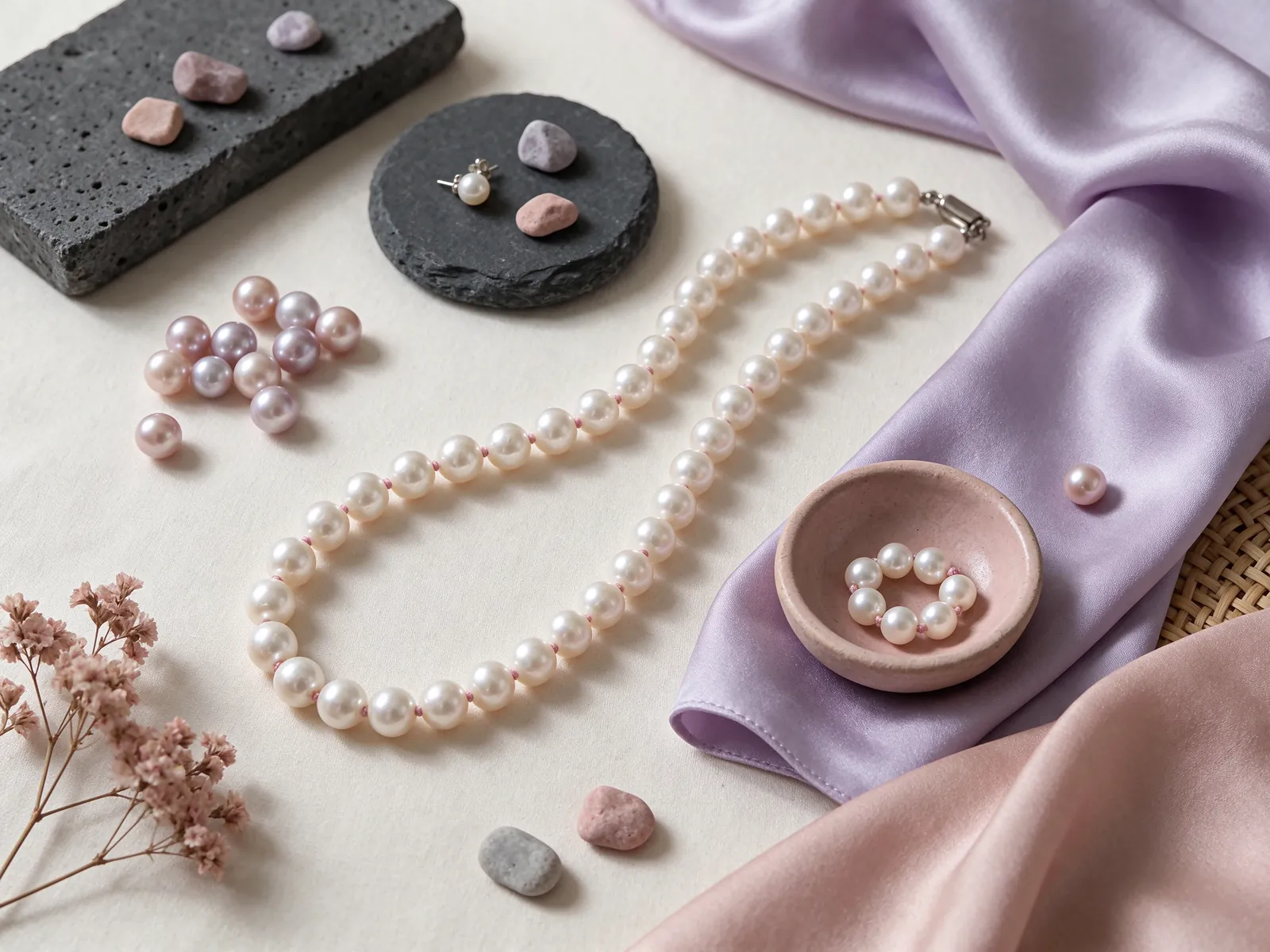
Plan pearl-safe care and a useful customization discussion
Care must suit the pearl as well as the gold. GIA ranks pearl at 2.5 on the Mohs hardness scale and says pearls should never be cleaned with ultrasonic or steam cleaners. After wearing, wipe with a very soft, clean cloth, and avoid acids, perfume, hair spray and excessive heat. Do not assume that a cleaning method suitable for metal jewelry can be applied to an entire pearl ring.
Take the ring off before handling cleaning products, gardening or activities that could strike the setting, and keep a consistent safe place for it. During storage, prevent the pearl from rubbing against other hard objects instead of dropping it into a bag with keys. If the setting seems loose or the fit changes suddenly, stop wearing the ring and arrange an inspection. Twisting or pulling the pearl repeatedly is not an appropriate security test.
Explain your routine alongside your preferred metal color
A conversation with Flint Jewelry can start with images of your everyday accessories, the intended finger, any sizing information you have and the activities that influence the design. Describe the metal color, the band outline and the places where you want to avoid contact. Use photographs to communicate proportion and mood rather than as a demand for an identical object. This gives customization a practical context instead of reducing the decision to a color label. Contact Flint Jewelry on WhatsApp or call +85260106207 to discuss metal colors, ring fit and everyday styling.
| Decision | Look for | Wardrobe connection | Practical check | Common misunderstanding |
|---|---|---|---|---|
| 18K 750 white gold | A clear relationship with white-metal accessories | White-metal watches and cool or dark sleeves | Compare beside your everyday watch | White appearance does not mean platinum |
| 18K 750 yellow gold | The amount of warmth and visual emphasis | Cream, navy and warm-metal accessories | Keep the background and lighting comparable | A warm setting does not identify pearl color |
| 18K 750 rose gold | A warm accent that works with familiar jewelry | Neutral clothing with one warm focal point | Compare daylight and your normal indoor light | Rose gold does not require a pink pearl |
| Band width and sizing | Room at the knuckle, finger base and adjacent fingers | Evaluate single wear and stacking separately | Extend and relax the fingers, then make a gentle fist | The same size number need not feel the same |
| Pearl and setting outline | Visible spread, height and neighboring contact | Consider cuffs, knitwear and hand movements | View the side profile beside another band | A photograph does not establish the ring's specifications |
Pearl knowledge and authoritative references
GIA describes seven pearl quality factors: size, shape, color, luster, surface quality, nacre quality and matching for jewelry with more than one pearl. These help organize pearl selection beyond the color of a gold setting.
Read the reference for this factFrequently asked questions
What information distinguishes white gold from platinum?
Use the complete material description. This guide identifies 18K 750 white gold separately from PT950 and PT900 platinum. The setting's white appearance alone cannot tell you which material it uses.
Does choosing rose gold tell me what color or variety the pearl is?
No. Rose gold describes the metal. Evaluate the pearl independently and then consider the pairing; metal color cannot establish pearl variety, origin or natural-versus-cultured identity.
How can I mix a warm gold ring with mostly white-metal jewelry?
Use the ring as a deliberate warm accent and compare it beside your usual watch and sleeve. Keeping one tone dominant can make the arrangement feel calmer, but every accessory does not have to match.
Is a US size conversion enough when I reference a Japanese ring?
It is a starting point, not a complete fit assessment. Keep the original number and system, then consider band width, inner contour, the intended finger and the balance of the pearl setting.
What should I check before stacking a pearl ring with another band?
Look at the side view and check whether the other band touches the pearl or pushes the setting. Try natural movements without forcing a tight stack. Separate fingers can preserve the styling relationship without that contact.
Updated: