
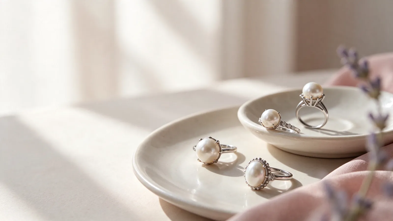
Evaluating South Sea pearl ring designs: how should a white South Sea pearl ring relate to your hand's proportions?
Start by deciding how much of your hand you want the ring to visually occupy. The pearl may be the center of attention, but the shoulders and band determine how that focal point connects with your finger. Look for the space beside the ring and the distance to your knuckles. A prominent outline is not automatically wrong for a shorter finger, just as a long finger does not require a substantial design.
Compare the ring with your hand relaxed, not only in a carefully arranged pose. Does the center look separate from the band, or do the lines read as one continuous shape? Either effect may appeal to you, but it helps to name the preference. The broader discussion of pearl rings can help organize these choices into proportion, decoration and fit before you focus on a particular white-pearl silhouette.
When comparing South Sea pearl ring designs, how do band width and setting height shape a white South Sea pearl ring's proportions?
A band that looks narrow from above may still have a noticeable side profile. Likewise, a lower setting does not answer every question about space near adjacent fingers. Evaluate width, height and neighboring contact separately. Picture bending your fingers, reaching into a pocket and pulling a sleeve into place. These everyday actions help you decide whether you prefer a more compact outline or are comfortable with a visibly raised focal point.
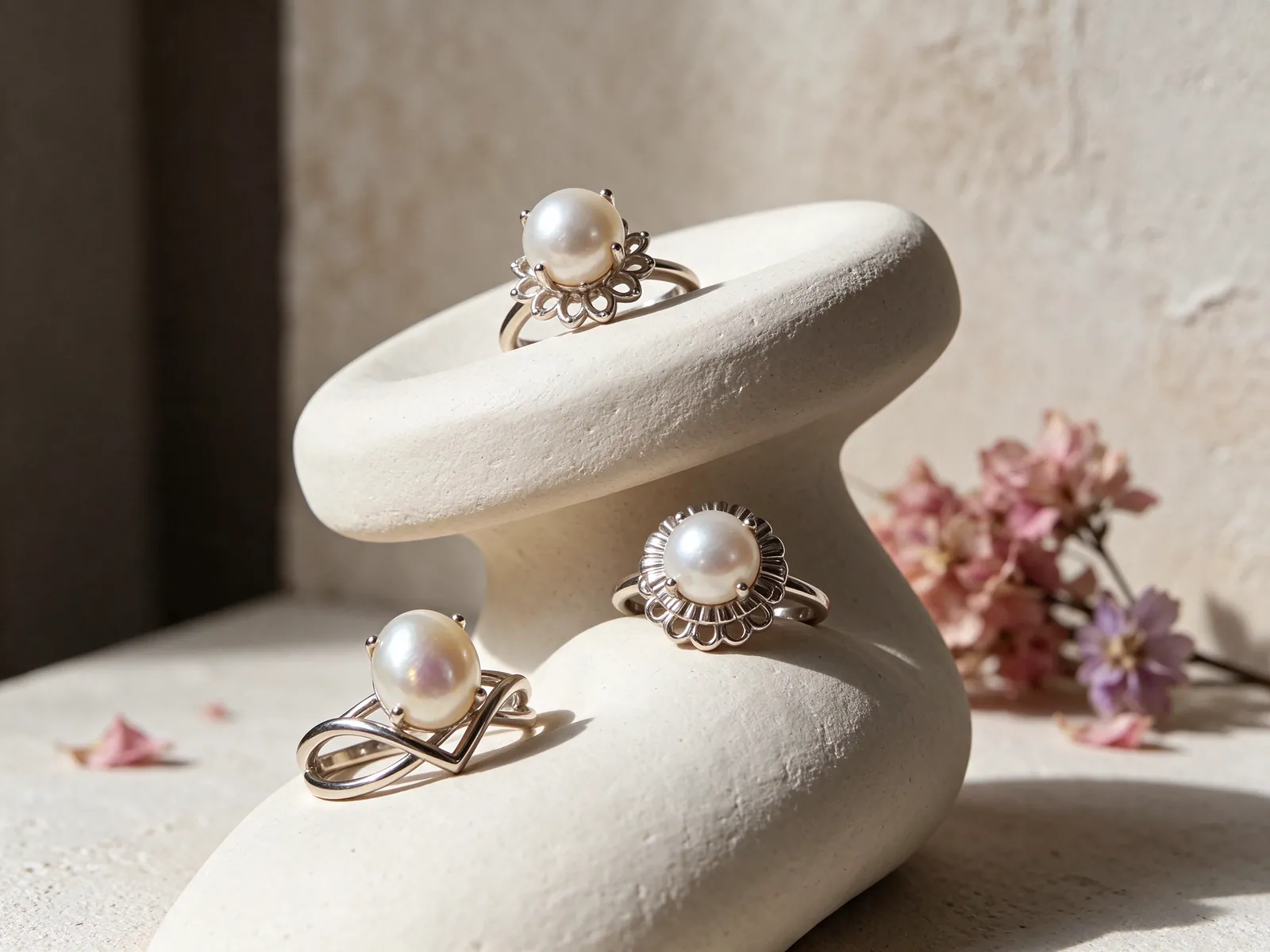
Evaluate the pearl beyond the word white
The appearance of a white pearl includes more than a simple light-or-dark judgment. GIA distinguishes bodycolor, overtone and orient, and not every pearl displays all three. Look at the overall tone under neutral conditions before seeing how it relates to your skin and everyday outfits. The guide to what are South Sea pearls provides background for the name, while an individual pearl still needs its own description and information.
GIA identifies seven pearl value factors: size, shape, color, luster, surface quality, nacre quality and matching. Use them to avoid making the whole decision about color or apparent size. For a ring, the visible relationship between the pearl and setting matters alongside the pearl's characteristics. When coordinating with earrings or a necklace, matching becomes a practical styling question: do the pieces support one focal point, or compete for attention?
Check whether the pictures offer a fair visual comparison
Photographs with different exposure or background colors can create very different impressions. A bright image may lose detail, and a dark background may intensify the contrast of a white pearl. Look for comparable views and ask about lighting when an apparent difference is unclear. Do not infer origin, natural-versus-cultured identity or a certificate from whiteness, shape or reflection. Those are information questions, not conclusions a photograph can reliably supply.
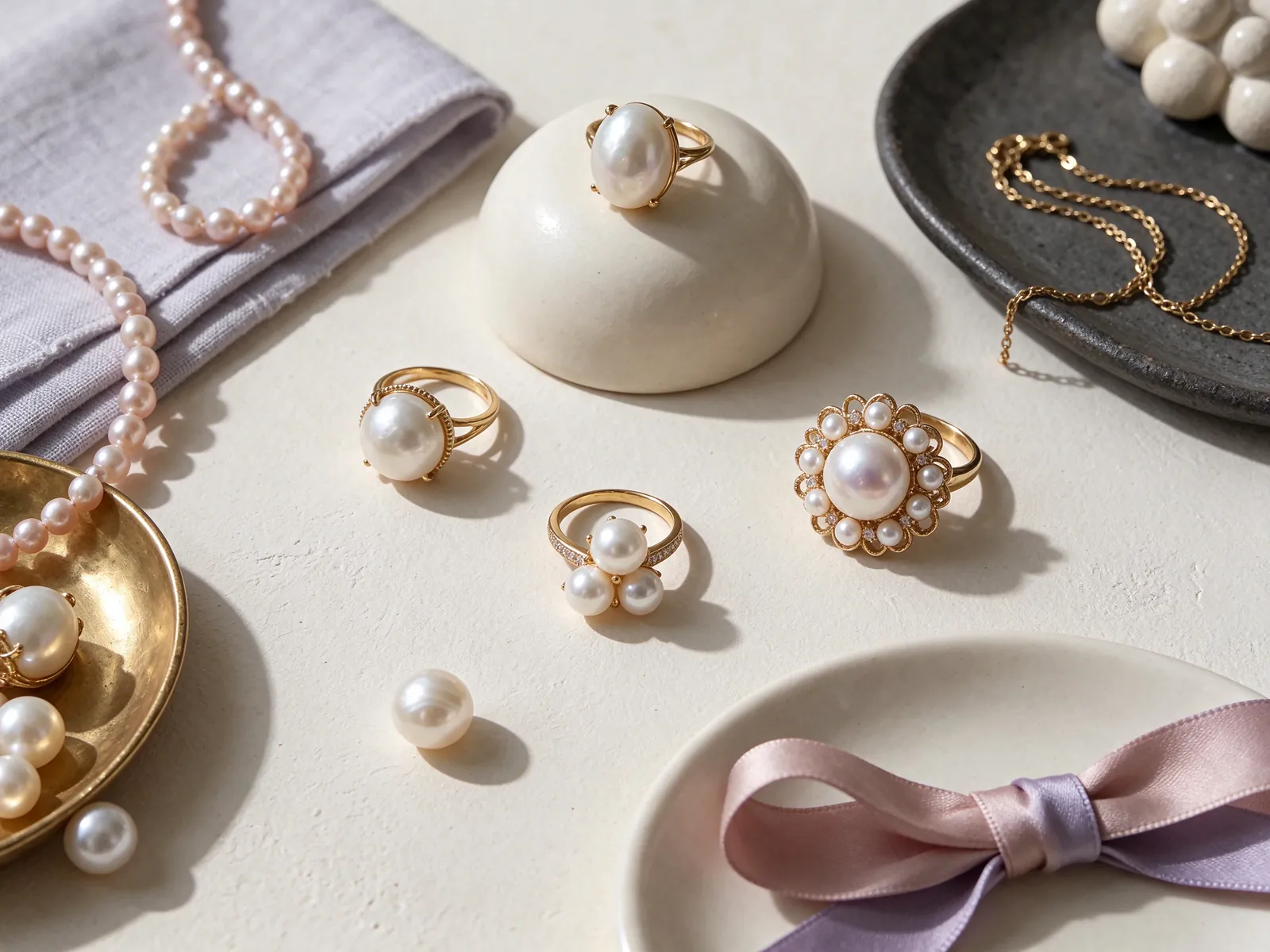
Make comparisons around a specific preference, not a label
Before exploring other pearl categories, identify what you want to change. Perhaps you want more space on either side of the finger, a quieter shoulder line or less visible height. An Akoya pearl ring can be considered with those same criteria, without assuming a fixed pearl diameter from its name. Compare the particular design's relationship to your hand instead of treating a category as a predetermined style.
For a different color relationship, consider how a Tahitian pearl ring might work with the clothing you already own. Keep the outfit consistent when comparing a white focal point with a darker one. You may discover that you prefer white beside a navy sleeve but another tone with a pale outfit. This is a styling preference, not a quality ranking, and one photographed pearl does not define every pearl in a category.
Distinguish a directional shape from a wider footprint
An unconventional outline can feel expressive because of the way it curves, not because it takes up more space. A baroque pearl ring is a useful topic when you want to explain asymmetry or an extended silhouette. Ask which direction you want the design to travel across the hand. That language can inform a discussion of the band and setting, while the pearl's shape alone still cannot establish its identity or origin.
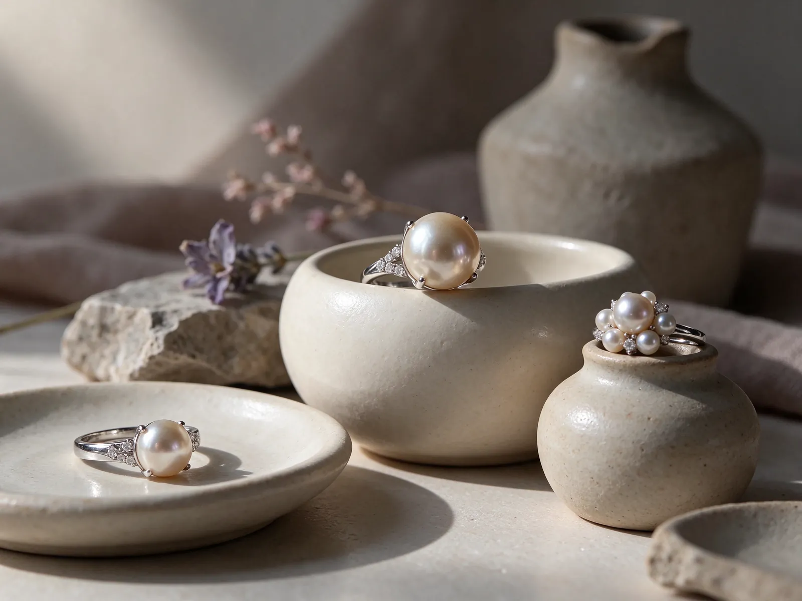
Choose how the setting frames the focal point
A simple-looking design places more attention on the transition from pearl to band. Examine whether the shoulders visually support the centerpiece or create a deliberate contrast with it. A clean outline is not just an absence of decoration: its effect depends on how the elements join. Compare an overhead view with an angled view to understand the shape you will see as your hand moves.
With a pearl halo ring, the surrounding outline becomes part of the overall focal area. Look at the ring from a normal viewing distance and notice whether the pearl or the border draws your eye first. A fuller frame may suit the statement you want, but it also changes the amount of visible finger space. Compare that footprint with your preferred balance rather than using brightness alone to choose a style.
Consider where details continue along the band
Shoulder decoration is easier to understand from an angled side view than from a flat top view. A pavé pearl ring offers another way to explore how detail can travel away from the center. Consider whether you want that movement to be noticeable or subdued. If you will wear another ring beside it, examine possible contact areas. A decorative technique by itself is not a promise of security, durability or suitability for every routine.
Build an outfit around the pearl without crowding your hand
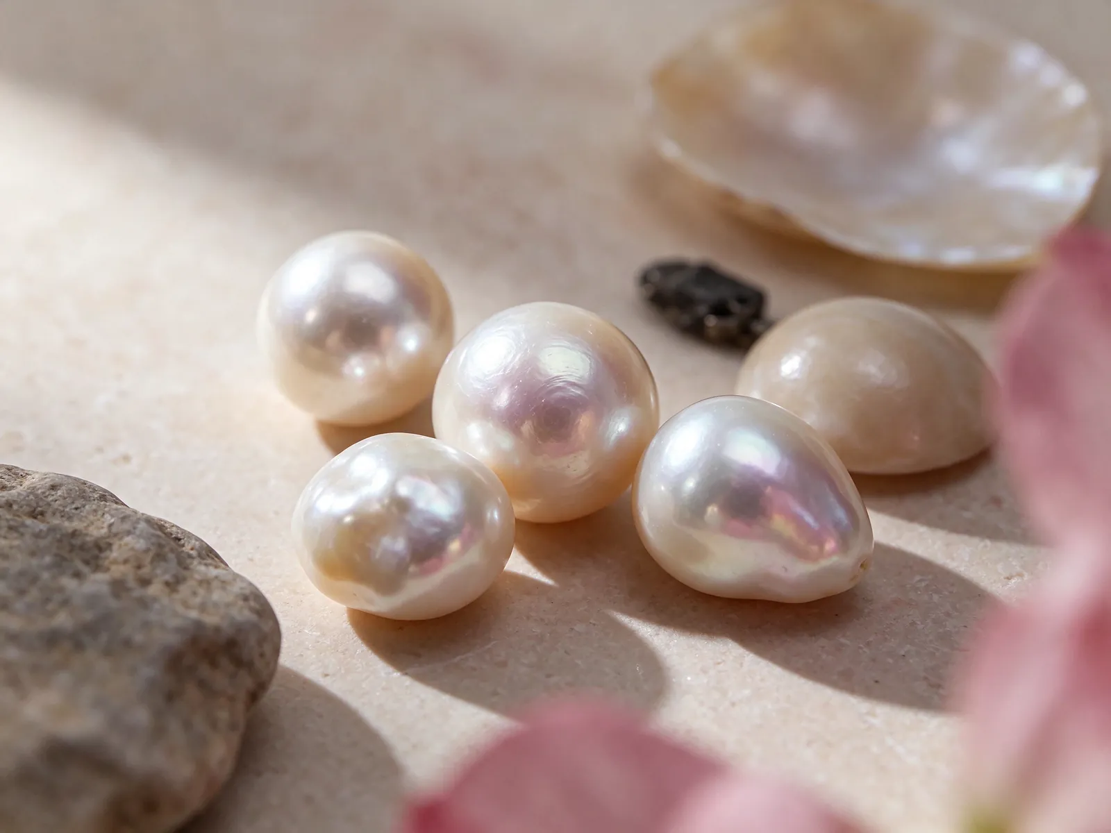
Try thinking about the ring beside a familiar jacket, a casual knit and an outfit for a special dinner. Each sleeve presents a different edge and may move differently around the focal point. A white pearl may stand out strongly against dark fabric, while pale clothing makes its outline and luster part of the distinction. Leave room for the effect before adding several other prominent pieces to the same hand.
Flint Jewelry's five customization material options are 18K 750 white gold, 18K 750 yellow gold, 18K 750 rose gold, PT950 platinum and PT900 platinum. For a metal-color conversation, compare your preferred tone with jewelry you already wear and the pearl's appearance under the same light. There is no need to choose a metal color solely because it seems like a conventional partner for white. The complete combination is what you will actually see.
Coordinate a wedding band without assuming the rings must touch
A wedding band can coordinate with a pearl ring even when worn on a different finger or hand. Separating them may give the pearl more visual space and reduce direct contact. If you want adjacent rings, consider the area below the pearl and the sides of both bands as your hand bends. The spacing in a posed photograph is only one position; daily movement can change where the pieces meet.
Plan for fit, handling and gentle care
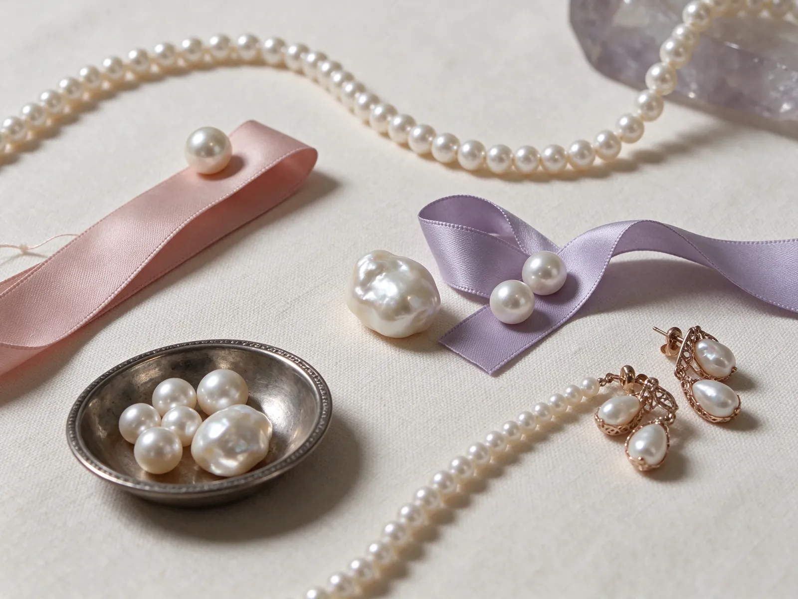
Ring fit includes the passage over the knuckle and the way the band sits once in place. Check whether it turns, presses against adjacent fingers or feels different when you close your hand. Making it tighter just to hold the centerpiece in one direction is not a complete solution. The band profile and position of the pearl deserve consideration together, especially if you intend to switch wearing fingers.
GIA lists pearl at 2.5 on the Mohs hardness scale. Think of that number as guidance about scratching, not a test result for how a finished ring will handle impact. Remove the ring for tasks involving cleaning products, exercise or objects that may strike the pearl. Avoid direct exposure to perfume and hair spray, and decide on a protected place to keep it whenever you take it off.
Know the difference between surface care and a loose connection
After wearing, GIA recommends a very soft, clean cloth for routine wiping. Pearls should not go into ultrasonic or steam cleaners, and should be kept away from acids and excessive heat. If the pearl seems loose or the setting looks bent, stop wearing the ring and do not try to twist, press or glue it into place. A clean surface does not confirm that the underlying connection is secure.
Turn inspiration into a clear design brief
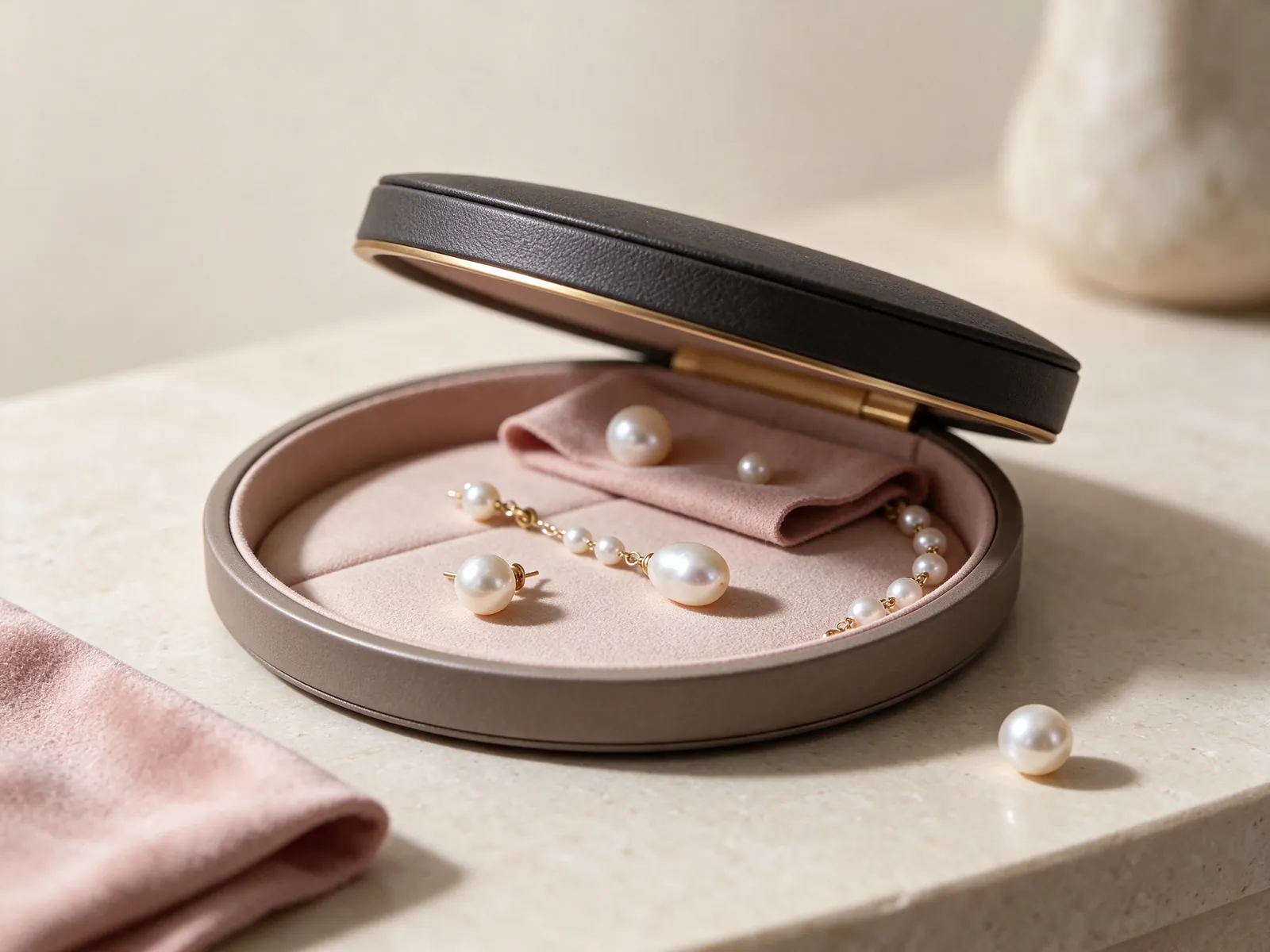
Collect the observations that will help a useful conversation: your wearing finger, the cuffs you wear most, the amount of visual space you prefer and the other jewelry you want to coordinate. With inspiration images, identify the actual feature you like rather than relying on a style label. Is it a quiet band, an elevated focal point or a continuous curve? This makes South Sea pearl ring designs easier to compare on consistent terms.
Then separate questions about the pearl from questions about the setting. Read the description and information corresponding to the individual pearl, and discuss its dimensions alongside the whole ring's outline. A photographed hand is not a reliable measurement scale. If you use your own hand images to explain a preference, include a relaxed open view and a side angle so the conversation reflects more than a single pose.
Ask how the idea fits the occasions you actually have in mind
Picture the design during a working day, an evening out and your normal household routine. You might prefer a particular silhouette for occasions when the ring can remain a deliberate focal point, rather than expect it to suit every task. Plan when it would be removed and how other jewelry would be arranged. Talk about ring style and fit with Flint Jewelry on WhatsApp, using these practical details to explain the look and wearing experience you want.
| Design question | Useful comparison | Visual choice | Practical check |
|---|---|---|---|
| Focal area | Look at the ring with the whole hand visible | A compact accent or a more expansive outline | Space beside the finger and near the knuckles |
| Pearl appearance | Compare angles under similar lighting | Contrast or coordination with your wardrobe | Do not confuse exposure with surface quality |
| Band and shoulders | Use overhead and angled views together | A quiet transition or visible supporting lines | Pressure against neighboring fingers |
| Setting height | Inspect the complete side profile | A subdued outline or a raised centerpiece | Interaction with cuffs and handled objects |
| Coordinating pieces | Look beneath the pearl and beside both bands | Shared styling or separate focal points | Whether jewelry touches when fingers bend |
Pearl knowledge and authoritative references
GIA places pearl at 2.5 on the Mohs hardness scale. That figure is relevant to avoiding scratches on a South Sea pearl ring, but it should not be interpreted as a guarantee about a finished ring's resistance to impacts.
Read the reference for this factFrequently asked questions
Does choosing a larger-looking pearl guarantee a better ring?
No. Size is one of GIA's seven pearl value factors, not a complete assessment. The pearl's other characteristics, its relationship with the setting and the way the ring fits your hand all matter. A visually prominent centerpiece can be a preference without being a quality ranking.
Can a lower-profile white South Sea pearl ring still be a statement piece?
Yes, visual impact also comes from the focal area, surrounding outline and contrast with clothing. Height is only one part of the silhouette. Compare the front and side together, including clearance near adjacent fingers, rather than equating low profile with an understated look.
What should I consider when coordinating the ring with a watch?
Look at how the watch and ring share attention, then consider whether their positions allow comfortable movement without contact. Wearing them on opposite hands can preserve a distinct focal point. Matching metal colors is a styling choice, not a requirement for a balanced outfit.
Is it sensible to leave the ring on during household cleaning?
Remove it before using cleaning chemicals or handling objects likely to scratch or strike the pearl. GIA advises avoiding acids, excessive heat and direct contact with substances such as perfume and hair spray. Keep a protected place available so removal is straightforward.
Why do two online images of a white pearl look so different?
Lighting, exposure, camera settings and background contrast can alter the impression. Look for views made under comparable conditions and ask about the viewing environment. An image difference alone does not prove a different grade, origin or pearl identity.
Updated: