
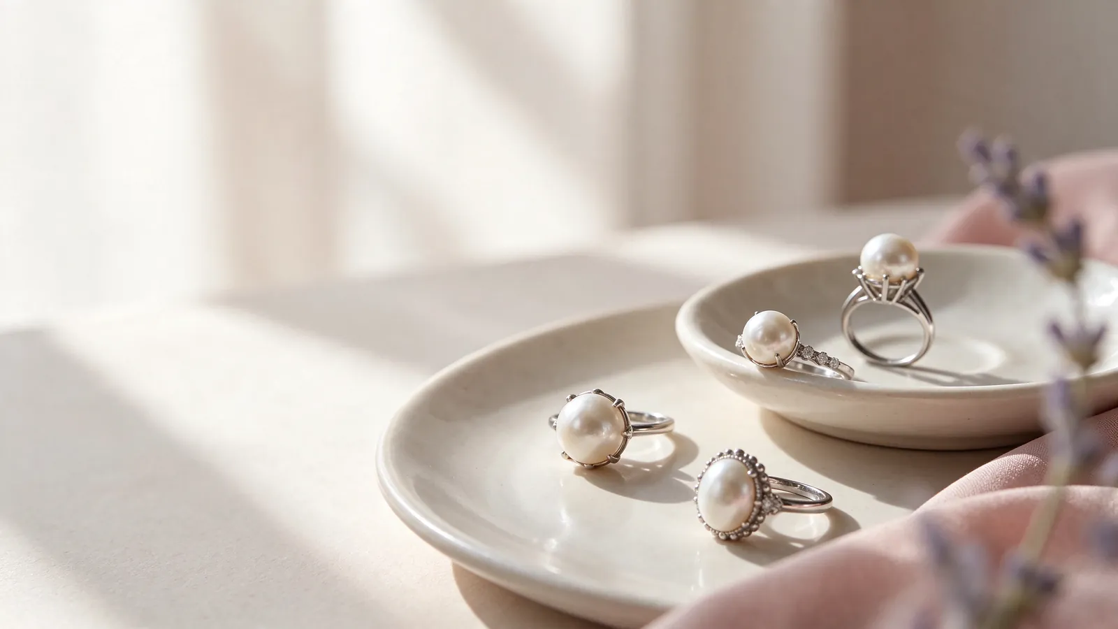
How do lighting and wardrobe colors shape your choice of a pink freshwater pearl ring, a lavender freshwater pearl ring or a purple freshwater pearl ring?
A useful color comparison starts with repeatable conditions. Put the pearls you are considering in the same light and look from similar angles, instead of comparing an indoor image with a sunlit image. A pink freshwater pearl ring may seem warmer beneath a warm lamp, while lavender may appear quieter in another setting. The first question is whether you are seeing a difference between pearls or simply a difference between viewing conditions.
Once you have compared the pearls against an unpatterned background, bring in a shirt or jacket you often wear. Bright nails, printed fabric and a reflective watch can all become part of the visual impression. Remove those distractions at first, then include them deliberately for the styling test. For basic context, the what are freshwater pearls guide explains the category; it does not determine an individual pearl's exact appearance or how it will complement your wardrobe.
Why compare a pink freshwater pearl ring, a lavender freshwater pearl ring and a purple freshwater pearl ring against the same neutral background?
A plain white or light-gray background gives the candidates a shared visual setting. Observe the main color, then gently change the viewing angle to see whether pink or purple remains dominant or appears as a surface effect. This is a comparison method, not a grading procedure. Phone images are useful notes, but camera white balance and display settings can shift delicate colors; an unfiltered side-by-side image is preferable to separate glamour shots.
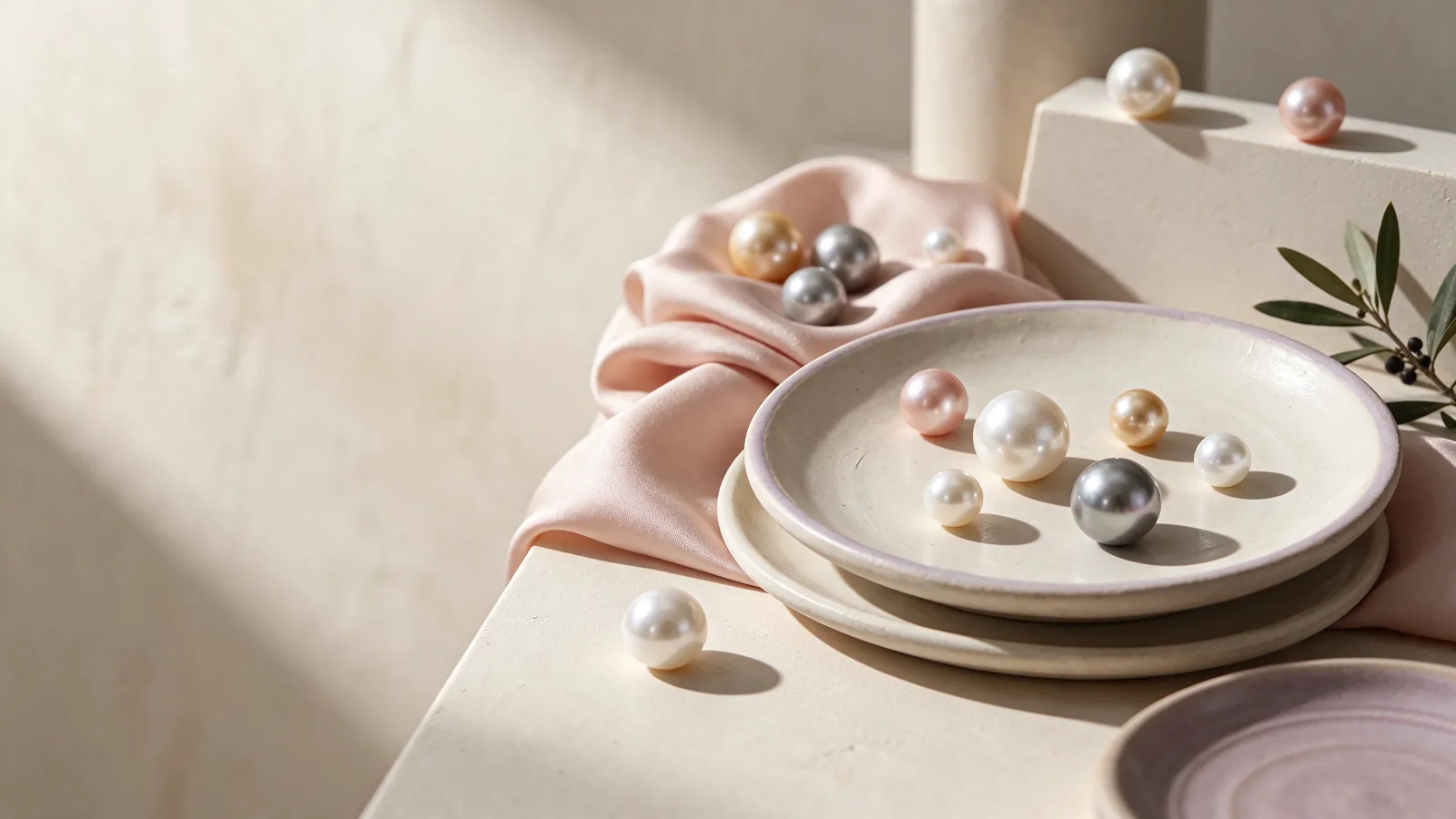
Describe the shade you see, not just the shade name
Lavender can mean different things to different people. You might prefer a pink-leaning shade, a cooler purple impression or a softer grayish lilac. GIA distinguishes bodycolor, overtone and orient, while noting that not every pearl displays all three components. Ask whether the color you love covers most of the pearl or changes across its surface as the pearl turns. That observation is more informative than expecting every lavender label to look alike.
Compare luster independently from color. In shared lighting, look at the clarity of reflections and inspect the overall surface, not only one bright highlight. A pale shade can still have an engaging appearance, and a deeper purple should not distract you from a surface feature you dislike. The freshwater pearl ring guide expands the comparison to shape and setting, helping you make a decision that is not driven by the color name alone.
What can a color label tell you about treatment?
Pink, purple and lavender describe appearance. They do not, by themselves, establish treatment status, origin or whether a pearl is natural or cultured. Keep those questions separate when reading a description. If there is a laboratory document, check that it describes the pearl being considered and read its actual conclusions. A photograph or collection name cannot stand in for the identity and treatment information of an individual pearl.
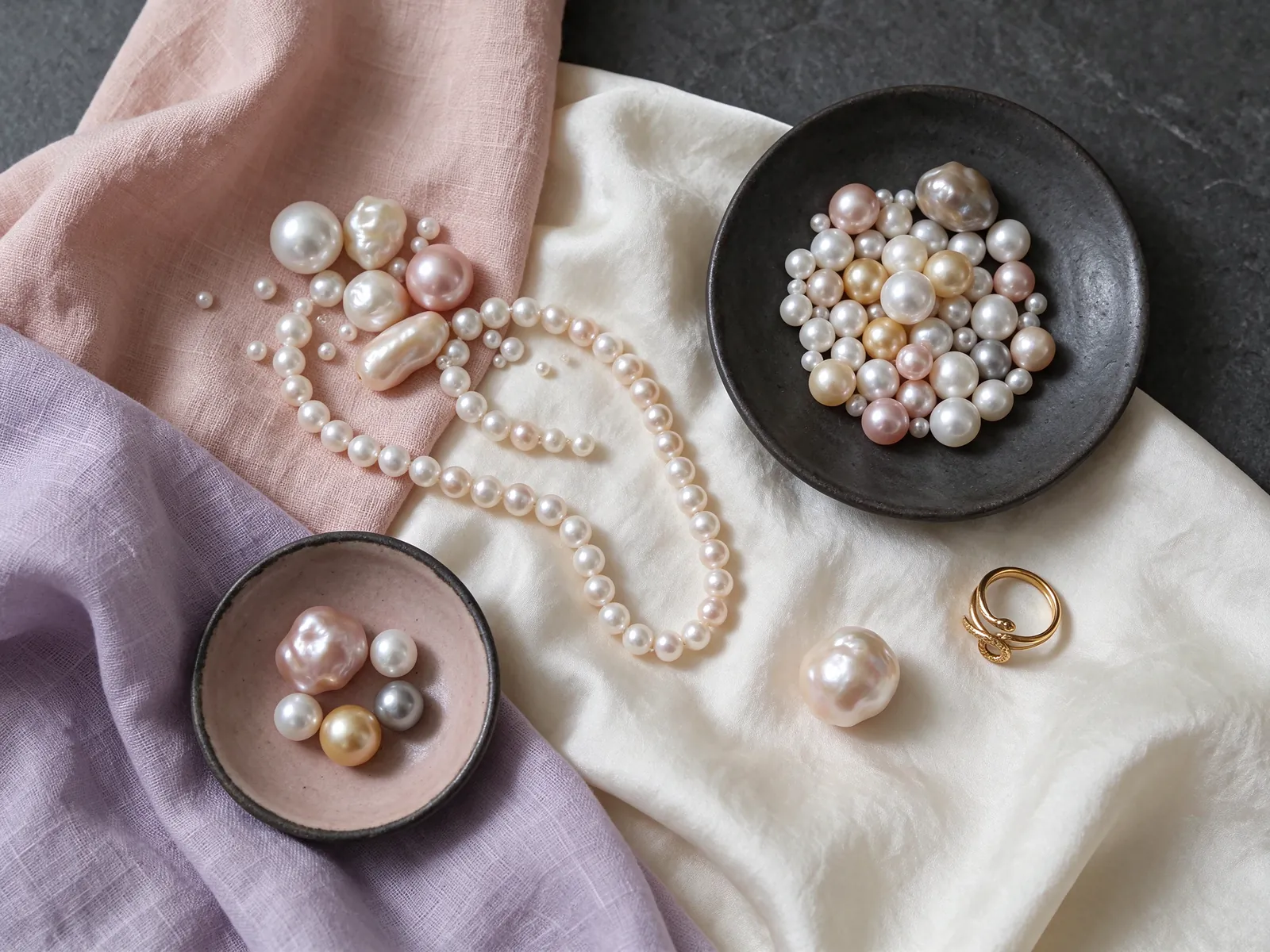
Use everyday clothes to test your preferred contrast
With ivory, camel or soft-pink clothing, a warmer pink impression is a sensible starting point to try, not a requirement. Lavender may offer a gentle accent beside charcoal, navy or cool white. Test whether you want the ring to blend into those clothes or be noticed against them. Your usual bag and watch deserve a place in the comparison too. There is no single pearl color that everyone with a particular complexion must wear.
A metal frame changes the overall visual pairing without proving anything about the pearl's origin or treatment. The material options for this comparison are 18K 750 white gold, 18K 750 yellow gold, 18K 750 rose gold, PT950 platinum and PT900 platinum. Explore the 18K gold pearl ring guide to organize your preference for warmer or cooler framing. Judge the complete look rather than assuming one metal always enhances every pink or purple pearl.
How do you keep a pastel ring from competing with an outfit?
Try reducing other colorful accessories on the hand and letting the pearl provide the accent. A simple cuff can give a subtle lavender shade room to be seen. For an evening outfit, compare it against the actual darker fabric rather than assuming the color will remain equally visible. If a pink pearl feels too coordinated with a pink sleeve, try a neutral sleeve before deciding the pearl itself is wrong for your style.
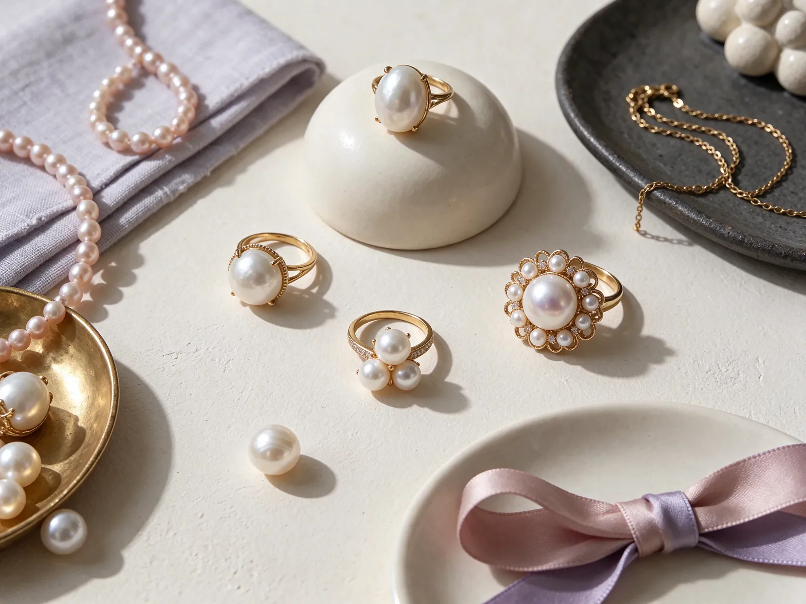
Think about profile, movement and fit together
A ring is not worn in the isolated close-up seen on a screen. Finger shape, knuckles, band width and setting height all enter the picture. Examine the top view and the side, then let your hand relax. When comparing pearl rings, a prominent profile may appeal visually, but you should also notice how it interacts with a sweater cuff, a pocket or a bag handle during ordinary movement.
Fit affects where the color is presented on your hand. A loose ring may rotate inward, while a tight one may feel distracting. Check that it stays reasonably positioned and moves over the knuckle without being forced. Band width can change the feel, so the size of another ring is only a starting point. Read how to measure ring size to prepare, then evaluate comfort with the actual design you are considering.
What should you do during a practical try-on?
Pick up your phone, hold a pen and place your hand lightly on a table. Look for repeated rotation or interference with comfortable movement. If you plan to wear a second ring, examine whether its hard edges could rub against the pearl. The purpose is not to stress-test jewelry, but to understand proportions in normal use. A wearable profile matters more than selecting the largest-looking pearl in a photograph.
Compare quality without letting purple become a shortcut
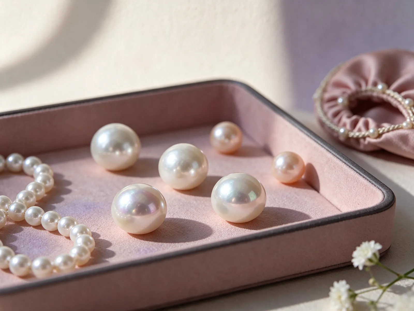
GIA lists seven pearl value factors: size, shape, color, luster, surface quality, nacre quality and matching. Color is only one part of this framework. Shape and visible surface features matter directly for a single-pearl ring, while matching becomes more relevant for multiple pearls or a coordinated set. The framework helps organize questions; it does not imply that a photograph reveals every factor or that a descriptive color establishes a grade.
Before comparing candidates, identify the features that matter to you. Perhaps you prefer pinkish lavender, clear reflections and a lower side profile. If the most appealing color comes with a surface feature you notice, inspect where that feature sits when worn. Consider the setting and stated pearl details together. Do not assume a purple pearl is necessarily rarer or a higher quality grade solely because its name sounds more unusual.
Can an irregular outline be part of the appeal?
An asymmetrical pearl can provide an individual silhouette within a soft color palette. Use the baroque pearl ring guide to consider that shape preference, then view the pearl from several angles and assess its relationship to the setting. Irregularity is not automatically a defect or a superior quality claim. Shape alone does not establish origin, treatment or natural-versus-cultured identity; luster, surface appearance and comfortable proportions remain separate considerations.
Choose with a realistic pearl-care routine in mind
Hands bring jewelry close to cleaning products, hard surfaces and accidental knocks. GIA places pearl at 2.5 on the Mohs hardness scale, which makes avoiding abrasion a relevant concern. The number is not a guarantee about protection offered by any setting. Remove the ring for household cleaning, sports and tasks likely to scrape or strike the pearl, and consider whether those removal habits fit the way you expect to wear it.
Gently wipe the pearl with a very soft, clean cloth after wearing and store it separately from pieces with hard edges. Avoid acids, perfume, hair spray and excessive heat. Pearls should never be placed in ultrasonic or steam cleaners, even when a method might be suitable for the surrounding metal. A pastel color does not mean casual cleaning is safe; assess the pearl and the rest of the ring separately.
What is the first step if something seems loose?
Stop wearing the ring if the pearl moves or you notice an unfamiliar surface change. Put it somewhere safe and explain the observation to a jewelry professional. Do not twist the pearl, add glue or rub the surface in an attempt to restore it yourself. Recording when the change appeared and any recent contact can make the conversation clearer, without adding more friction by repeatedly trying the ring on.
Make your shortlist useful for a preference discussion
A useful preference note says more than purple ring. Describe the direction of color, the clothes you intend to pair it with and whether you want a discreet or noticeable accent. Add your preferred side profile and the hand activities that matter to you. If a white-metal frame appeals, the platinum pearl ring guide offers a related comparison of how the frame and pearl contribute to the overall look.
Separate your notes into appearance, comfort and pearl information. Appearance covers shade and luster; comfort covers profile and rotation; information records the stated identity and treatment details. If two candidates seem equally appealing, return to your most-used clothes and everyday movements instead of collecting more color names. This makes the comparison about a ring's place in your life, not just which image you would save.
How can you communicate a subtle pink-purple preference?
Share an unfiltered image of a familiar garment as a color direction, not an exact standard for a pearl. When discussing preferences with Flint Jewelry, include your intended occasions, desired visual contrast and fit questions. That conversation is separate from any actual candidate's specifications. Read the individual pearl and setting details on their own terms before deciding whether they satisfy the look and wearing experience you have described. To discuss color direction, setting proportions or ring-fit questions with Flint Jewelry, contact us on WhatsApp or call +85260106207.
| Decision area | Observation | Wardrobe or movement test | Do not assume |
|---|---|---|---|
| Pink direction | Warmer or cooler appearance in shared light | Hold beside a neutral and a favorite sleeve | Every photograph shows the same shade |
| Lavender direction | Main color versus changing surface color | Compare charcoal, navy and cool white | Lavender is a fixed color grade |
| Luster and surface | Reflection clarity and visible features | Check feature placement when worn | One bright highlight represents the whole pearl |
| Profile and fit | Side height, rotation and knuckle passage | Pick up a phone and hold a pen | Another ring's size will feel identical |
| Care routine | Contact with hard edges and household products | Plan removal before unsuitable tasks | Metal-safe cleaning is pearl-safe cleaning |
Pearl knowledge and authoritative references
GIA describes seven pearl value factors: size, shape, color, luster, surface quality, nacre quality and matching. A pink or purple color is only one part of a broader comparison.
Read the reference for this factFrequently asked questions
Can I choose between pale pink and lavender from separate online images?
Separate images may use different light, white balance or editing. Use them to identify preferences, not to make a precise shade comparison. A shared neutral-background view and a comparison beside familiar clothing give you a better basis for deciding between subtle colors.
Do I need matching lavender accessories to wear a lavender pearl ring?
No. The ring can be a small accent beside neutral clothing. Try it with your usual watch and a simple cuff first. Adding more lavender is a styling choice, not a requirement, and may create more coordination than you want.
Does a natural-looking pink color prove the pearl is untreated?
No. An impression of natural-looking color is not evidence of treatment status or pearl identity. Read the specific description and any corresponding laboratory document. Color, origin and natural-versus-cultured identity are different questions.
Why does the ring keep turning even though I like the color?
Fit and the setting's proportions can affect how the ring stays positioned. Compare the band width, passage over the knuckle and ordinary hand movements with the actual ring. A size copied from a different design may not produce the same wearing experience.
What should I do after noticing the pearl move in its setting?
Stop wearing it and store it safely before asking a jewelry professional about the observation. Avoid twisting it, adding glue or continuing to wear it as a test. Note when movement appeared and any recent knocks or contact to help describe the situation.
Updated: