
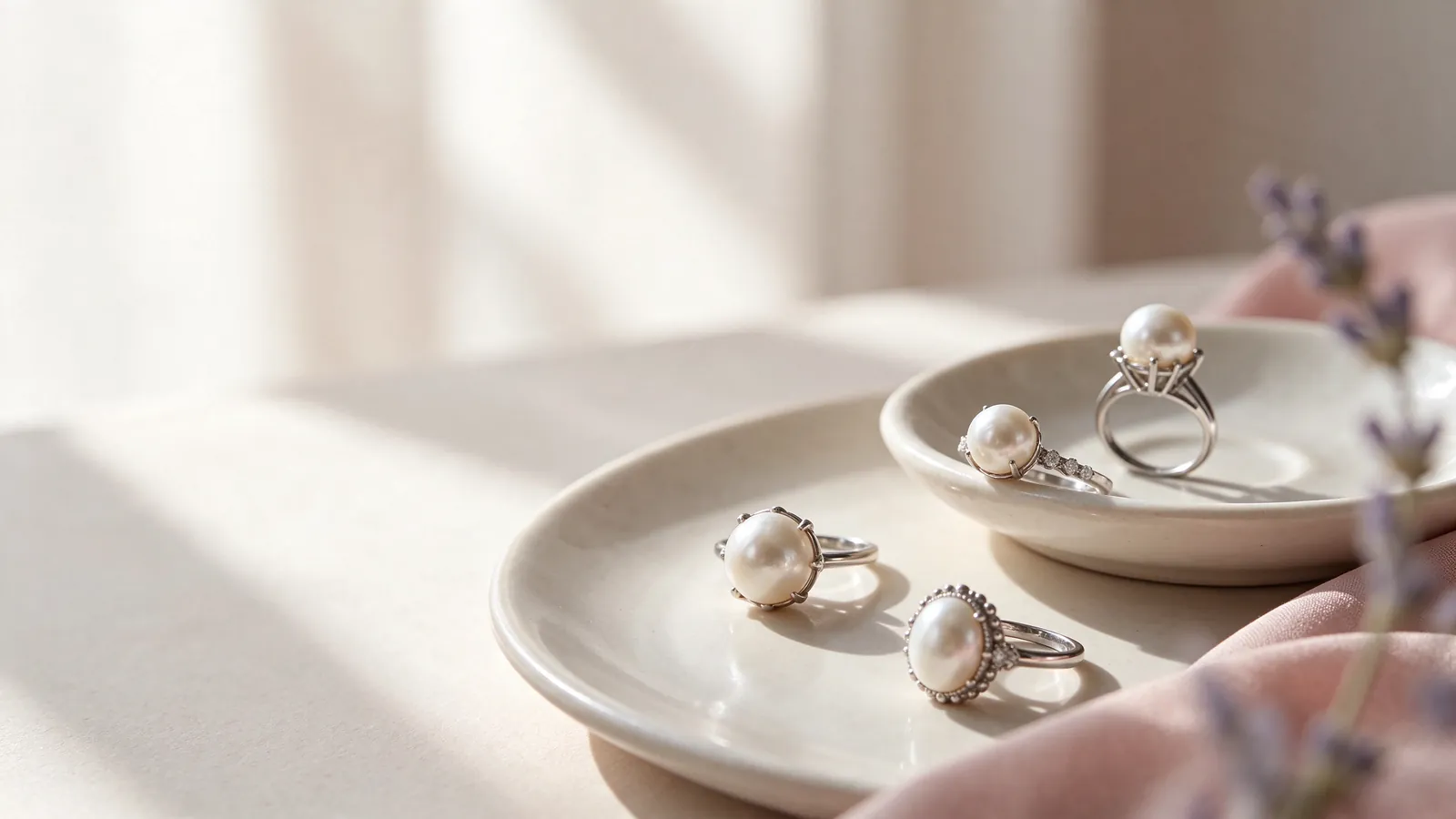
How do lighting and wardrobe colours shape your choice of a pink freshwater pearl ring, a lavender freshwater pearl ring or a purple freshwater pearl ring?
Begin with the colours you actually wear, rather than an idealised shade on a screen. A pink freshwater pearl ring may look warmer under warm indoor lighting, while a lavender tone may appear more muted elsewhere. Place candidates beside each other in the same position and view them from similar angles. Comparing one pearl by a window with another in shadow makes it difficult to tell whether the difference belongs to the pearls or the lighting.
After a neutral-background comparison, hold your hand beside a familiar sleeve. A patterned blouse, bright manicure or reflective watch can influence the impression of a pale pearl. Keep those elements out of the first comparison, then bring them back for the styling decision. The what are freshwater pearls guide provides useful background, but a broad pearl category cannot tell you exactly how an individual colour will look on your hand.
Why compare a pink freshwater pearl ring, a lavender freshwater pearl ring and a purple freshwater pearl ring against the same neutral background?
An unpatterned white or light-grey background makes the comparison more consistent; it is not a grading test. Look straight at each pearl, then turn it slowly to see whether the pink or purple impression stays dominant or appears only at particular angles. Photographs can record your shortlist, but automatic white balance and screen settings can alter subtle shades. A shared, unfiltered comparison photograph is more useful than separately edited images.
Read the colour beyond the label
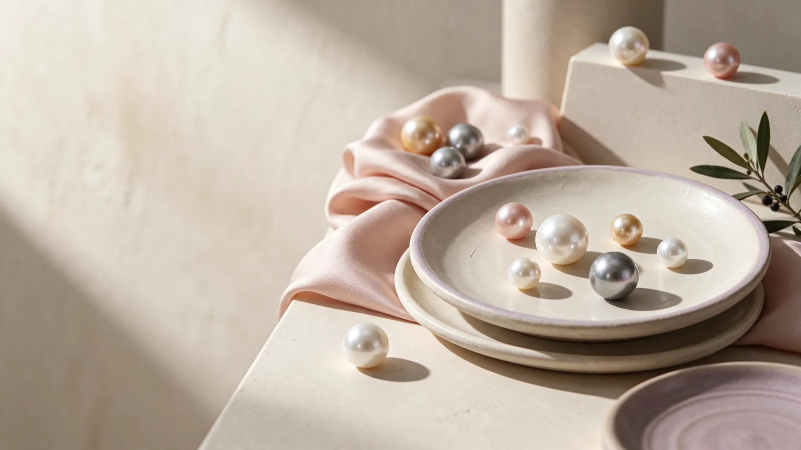
Lavender and purple are descriptive terms, not a universal boundary between pale and deep colour. Make your preference more precise: do you like pinkish lavender, a cooler purple or a greyish lilac impression? GIA distinguishes bodycolour, overtone and orient, and notes that not every pearl shows all three. Observe whether a colour occupies most of the visible pearl or forms a changing surface impression as you move it.
Lustre deserves its own comparison. Under the same light, consider the clarity of reflections and the appearance of the whole surface rather than the brightest photographed spot. A gentle colour need not be chosen at the expense of lively lustre. The freshwater pearl ring guide helps place colour alongside shape, surface and setting, so a pleasing name does not become your only selection criterion.
What would actually answer a treatment question?
The words pink, lavender and purple do not establish whether a pearl's colour has been treated, nor whether the pearl is natural or cultured. Read the stated pearl identity and treatment information separately. If a laboratory document accompanies a candidate, check which pearl it describes and what conclusions it actually gives. A colour label, attractive photograph or named collection cannot substitute for that information.
Build a wardrobe pairing rather than a skin-tone rule
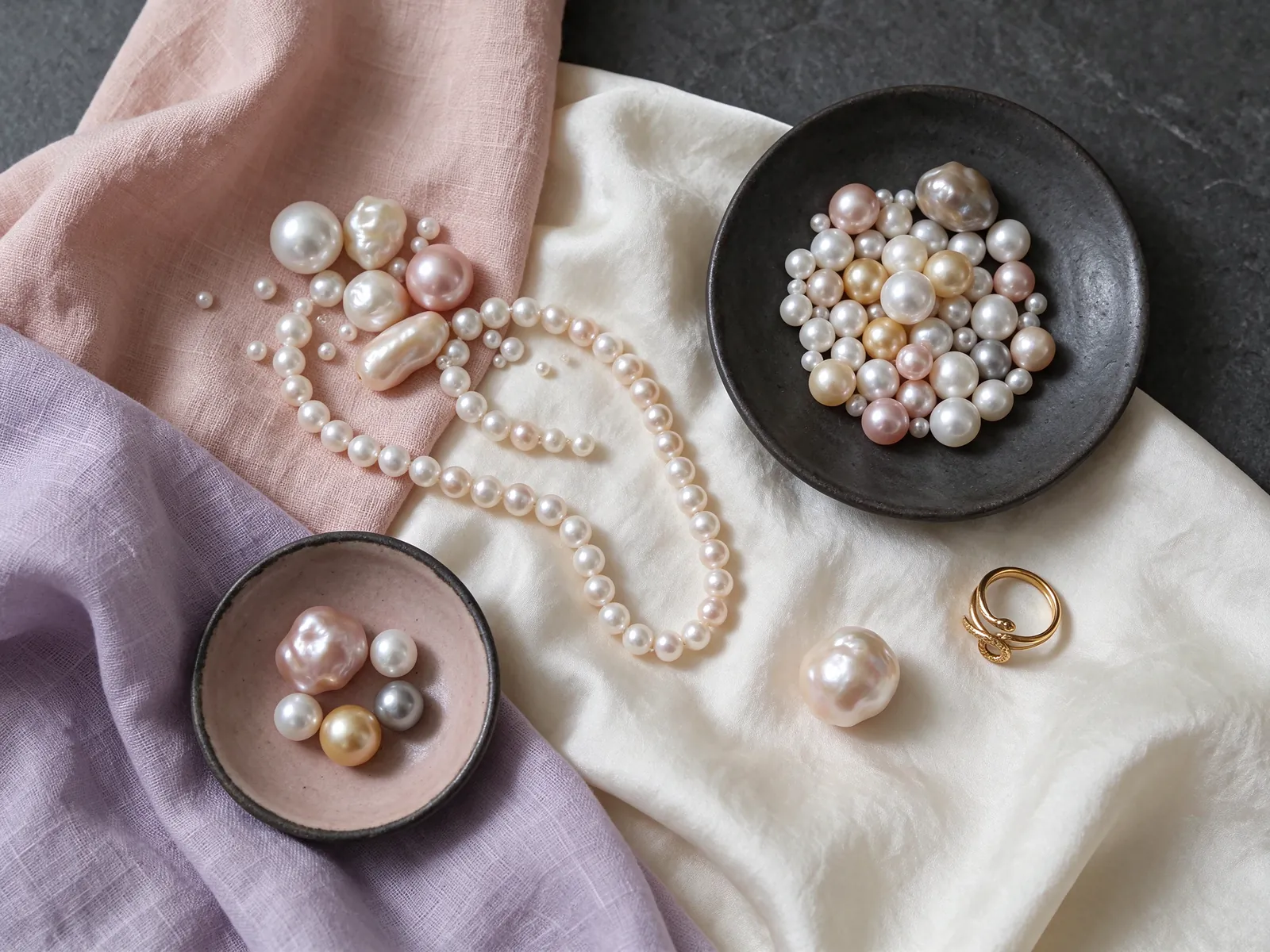
For a wardrobe of warm ivory, beige and soft pink, start by trying a warmer pink impression and see whether it feels harmonious or too similar. If you often wear grey, navy or cool white, lavender may provide a small colour accent. These are starting points, not rules about complexion or age. Compare the pearl with your usual watch and handbag as well as your clothes, because those combinations recur in daily life.
Metal colour can frame the pearl without determining its identity or quality. For visual comparisons, the material choices are 18K 750 white gold, 18K 750 yellow gold, 18K 750 rose gold, PT950 platinum and PT900 platinum. The 18K gold pearl ring guide can help you consider warmer and cooler framing. Assess the complete pairing rather than assuming that a particular metal always makes a pink pearl more flattering.
How can the same colour work at the office and dinner?
For office wear, try keeping the pearl as the only colourful feature on your hand, with a simple sleeve and fewer competing accessories. For dinner, hold it against the darker fabric you intend to wear and see whether the lavender remains visible or the pink becomes too discreet for your preference. Decide whether you want the ring to blend in or attract attention; that is more useful than assigning a colour to one occasion.
Judge the setting from the side as well as above
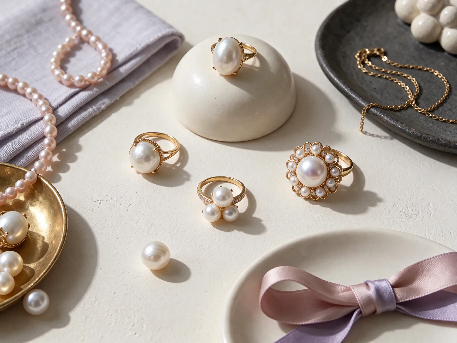
A close-up photograph gives the pearl centre stage, but wearing brings finger length, knuckles and band width into the picture. Inspect the setting's side profile and try relaxed hand positions. A raised pearl may be visually prominent, yet its interaction with knitwear, pockets and bag handles deserves attention. The pearl rings Hong Kong guide helps you compare setting styles; consider those everyday movements rather than relying only on a neatly posed, straight-finger photograph.
A loose ring may rotate towards the palm; a tight one can keep drawing your attention to pressure rather than colour. Check whether the ring stays reasonably positioned and passes the knuckle without forcing it. Different band widths can feel different even when you normally wear the same size. Consult how to measure ring size for preparation, then assess fit with the actual setting rather than estimating it from an image.
Which movements make a try-on informative?
Rest your hand lightly on a table, hold a pen and pick up your phone. Notice whether the setting interferes with comfortable movement or turns repeatedly. If you intend to wear another ring beside it, inspect the space between the pieces and avoid hard edges rubbing against the pearl. A proportion you enjoy wearing is more useful than choosing the largest-looking silhouette and hoping to adapt to it.
Use quality factors to organise a meaningful shortlist
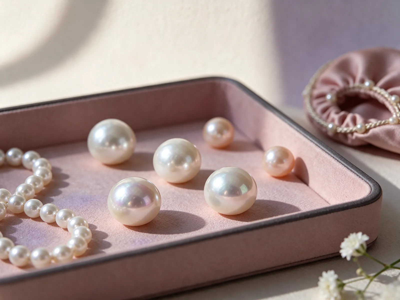
GIA identifies seven pearl value factors: size, shape, colour, lustre, surface quality, nacre quality and matching. Colour is therefore part of a wider assessment, not a complete judgement. For a single-pearl ring, shape and visible surface features affect the appearance directly; matching is more relevant when comparing multiple pearls or a coordinated set. This framework does not mean every factor can be established from a photograph.
Write down the features you care about most, such as a pinkish lavender impression, clear reflections and a modest side profile. If your favourite colour has a visible surface feature, view its position on the hand and decide whether it bothers you. Consider stated pearl information and the setting when weighing your preferences; a purple label alone does not establish rarity or a higher quality grade.
Could an irregular pearl suit a soft colour palette?
If you enjoy an individual outline, the baroque pearl ring guide offers a useful shape comparison. Look at how an asymmetrical pearl sits within the setting and whether turning it reveals a pleasing line. Irregular shape is not automatically a defect, a higher grade or evidence of origin. Treat it as a styling choice while still considering lustre, surface and the practical relationship between pearl and hand.
Plan care around what your hands do
A ring encounters desk edges, bag fittings and cleaning products more directly than many other jewellery pieces. GIA gives pearl a Mohs hardness of 2.5, a useful reminder to avoid abrasion rather than a prediction of how a particular setting will perform. Remove the ring before cleaning, sport or handling objects likely to knock or scrape it. Your willingness to remove and store it is part of selecting a practical everyday style.
After wearing, use a very soft, clean cloth for gentle wiping and keep the pearl separate from hard-edged jewellery in storage. Avoid acids, perfume, hair spray and excessive heat. Pearls should never go into ultrasonic or steam cleaners. Do not assume a cleaning method suitable for the surrounding metal is suitable for the pearl as well; a soft-looking colour still needs careful handling.
What if the pearl moves or the surface looks different?
Stop wearing the ring if you notice movement of the pearl or an unfamiliar surface change. Store it safely and describe the observation to a jewellery professional rather than twisting the pearl, applying glue or trying to polish the area yourself. Note when you noticed the change and any recent contact with products or objects. Continuing to wear it to test the problem can add avoidable knocks and friction.
Turn a colour preference into a clear conversation
Instead of requesting only lavender, describe whether you prefer a pinkish, cool or greyish impression, and whether the ring should blend into your wardrobe or stand out. Add your preferred profile and the activities for which you expect to wear it. If you favour a white-metal frame, the platinum pearl ring guide is a relevant next step for comparing the visual relationship between metal and pearl.
Keep appearance, comfort and pearl information in separate notes. Record colour and lustre under appearance, height and rotation under comfort, and stated identity or treatment details under information. When two candidates appeal equally, return to your usual sleeves and hand movements before expanding the shortlist. That approach helps you choose for real use without mistaking a beautiful photograph for a complete answer about the ring.
What is useful to share when discussing preferences?
An unfiltered photograph of a favourite garment can communicate a colour direction, provided it is treated as inspiration rather than an exact pearl-colour standard. When contacting Flint Jewellery, describe your wardrobe, intended occasions and any fit questions alongside it. A discussion of preferences is distinct from a particular product's specifications. Read the details of any actual candidate separately before deciding whether it answers those preferences. To discuss colour direction, setting proportions or ring-fit questions with Flint Jewellery, contact us on WhatsApp or call +85260106207.
| Focus | What to observe | Styling test | Common blind spot |
|---|---|---|---|
| Soft pink | Warmer or cooler impression on a neutral background | Hold beside beige and a familiar sleeve | Warm lighting can alter the impression |
| Lavender or purple | Dominant colour versus changing surface colour | Compare grey, navy and cool-white fabrics | Colour names have no fixed shade boundary |
| Lustre and surface | Reflection clarity and visible features in shared light | Consider the feature's position on the hand | The brightest image is not the whole surface |
| Setting and fit | Top view, side height and passage over the knuckle | Hold a pen and pick up a phone | A loose ring may rotate |
| Daily care | Likely knocks and contact with cleaning products | Plan removal for unsuitable activities | No ultrasonic or steam cleaning for pearls |
Pearl knowledge and authoritative references
GIA identifies seven pearl value factors: size, shape, colour, lustre, surface quality, nacre quality and matching. Colour is one factor, not a complete quality judgement.
Read the reference for this factFrequently asked questions
Why does a lavender pearl look pinker in one photograph?
Lighting, surrounding colours, camera white balance and screen settings can change the impression of a subtle shade. Compare candidates together against a neutral background, then inspect them beside your usual clothing. Separately edited photographs are a weak basis for choosing between close colours.
Can a pink pearl work with a mainly navy wardrobe?
It can be a small contrast rather than a matching accessory. Try it beside a navy sleeve with your usual watch and decide whether you like the amount of contrast. There is no need to add several other pink accessories unless that is the effect you want.
Does purple colour establish an untreated pearl?
No. A colour description does not establish treatment status, origin or natural-versus-cultured identity. Read the stated pearl information and any document that specifically describes that pearl, rather than treating a colour or collection name as proof.
Should I reject a lavender pearl because it is not round?
Not solely for that reason. Consider whether the outline works with the setting and whether you enjoy its appearance from different angles. Assess lustre, visible surface features and comfortable wear separately; irregular shape is not an automatic quality conclusion.
Can I clean the ring in an ultrasonic cleaner if the metal tolerates it?
No. GIA advises that pearls should never be cleaned in ultrasonic or steam cleaners. The pearl needs to be considered separately from the metal. Routine care uses a very soft, clean cloth after wearing, with avoidance of chemicals and unnecessary friction.
Updated: