
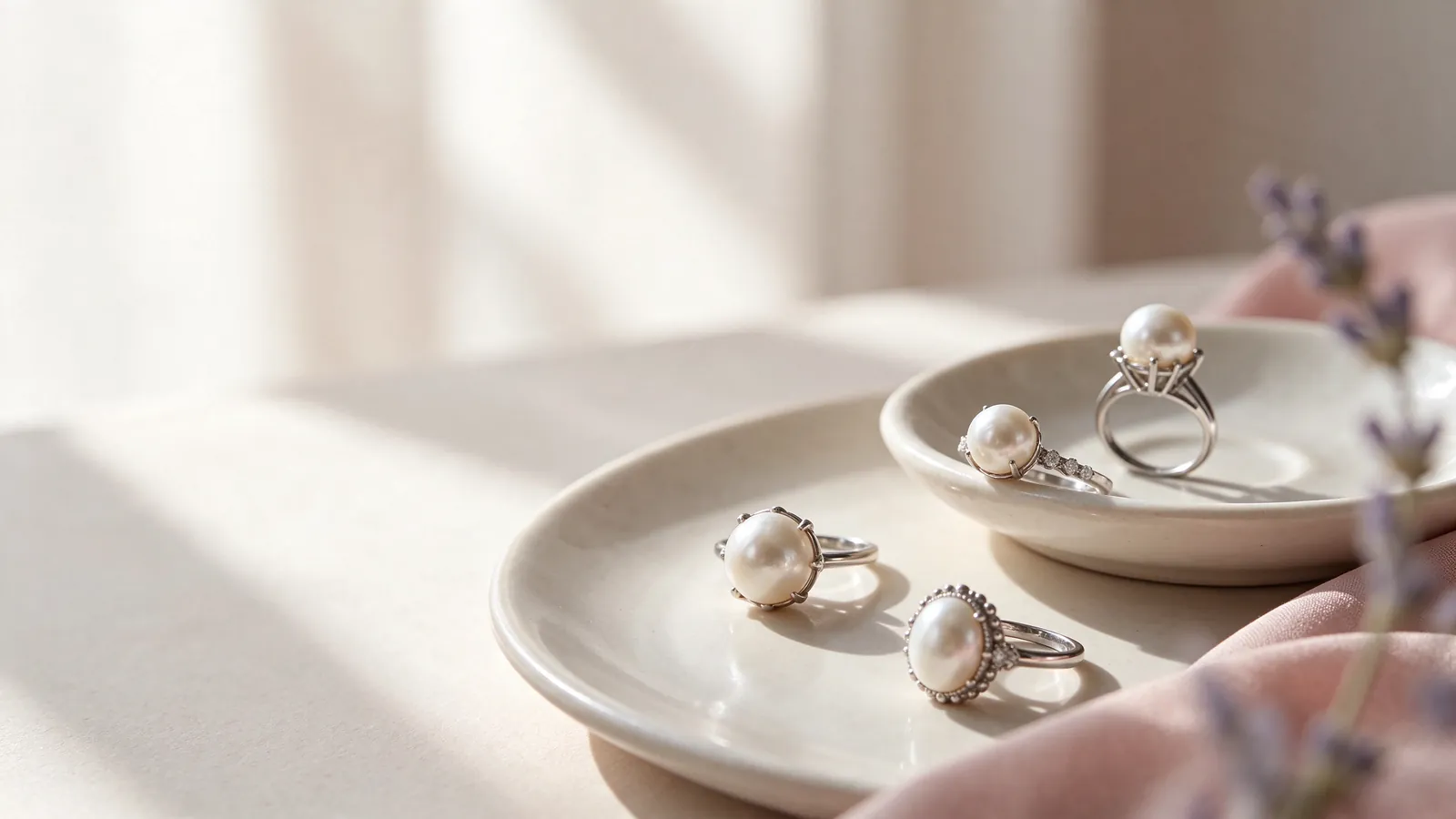
How do setting lines shape the look of a Tahitian pearl ring or Tahitian black pearl ring?
Start with the outline you want to see on your hand. A dark pearl framed by a slim band can read as a concentrated accent, while wider shoulders make the metal a larger part of the composition. Neither approach is automatically better for a short or long finger. Look at the hand in a relaxed position and decide whether you enjoy the amount of space the pearl occupies relative to the visible band.
Then turn your hand and examine the side. The height above the finger and the transition from band to pearl can change a ring's character even when the front view is similar. The pearl rings guide is useful for sorting broad setting preferences before concentrating on a dark center. Describe both parts of your choice: for example, a prominent pearl with restrained shoulders, rather than simply asking for a bold ring.
When trying on a Tahitian pearl ring or Tahitian black pearl ring, how do band fit and setting height affect comfort?
Try the band over the knuckle and at the finger base, noticing pinching, easy slipping or a need to keep readjusting it. Bend your fingers, hold your phone and let your hand close gently. Assess the upper profile separately from band fit, especially where it approaches the next finger. An excessively tight fit is not a good way to compensate for an uncomfortable or unstable silhouette.
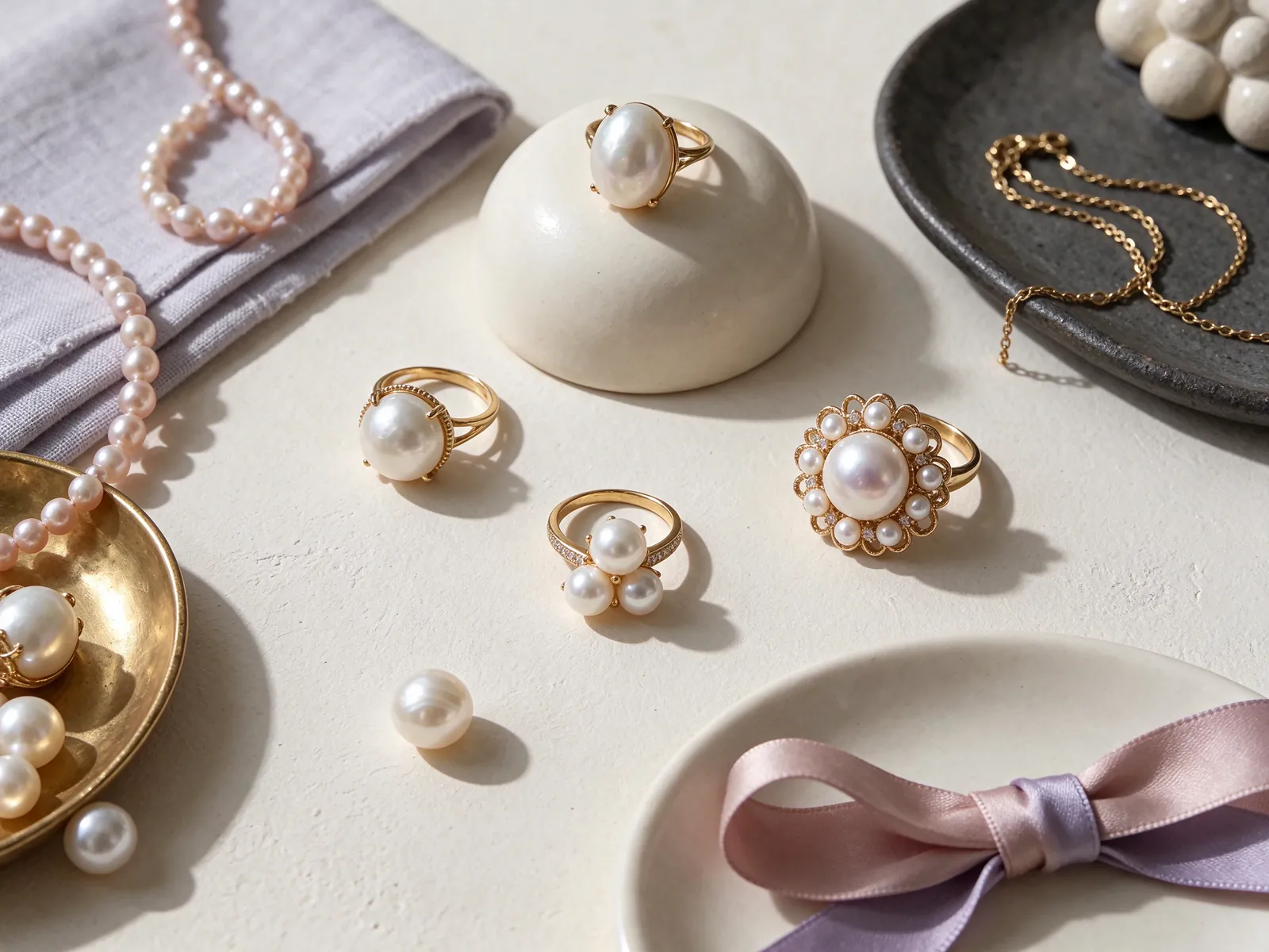
Choose the color you enjoy away from the camera
Do not let the term black pearl ring reduce your color choice to a search for the darkest photograph. Notice the overall darkness, the warm or cool impression and any surface color changes when the ring moves. GIA treats bodycolor, overtone and orient as distinct components, with not every pearl displaying all three. Reflections from a bright lamp or a colorful nearby object can complicate what a single image seems to show.
Check the pearl beside your skin and a frequently worn top in soft daylight and regular indoor lighting. You may prefer a subtle relationship with a dark jacket or a clear contrast against ivory fabric. Read what are Tahitian pearls for background on the topic, while keeping appearance and identity questions separate. The color or shape seen in a photo cannot by itself establish origin, natural-versus-cultured status or certification.
Use photographs as a consistent comparison tool
Include your hand and keep distance, background and lighting similar between images. Changing filters or exposure can make a color appear more convincing without helping you compare the actual rings. Record observations such as a gentler contrast or a cooler impression. Those descriptions translate a visual preference into a useful discussion more reliably than a heavily edited favorite image.
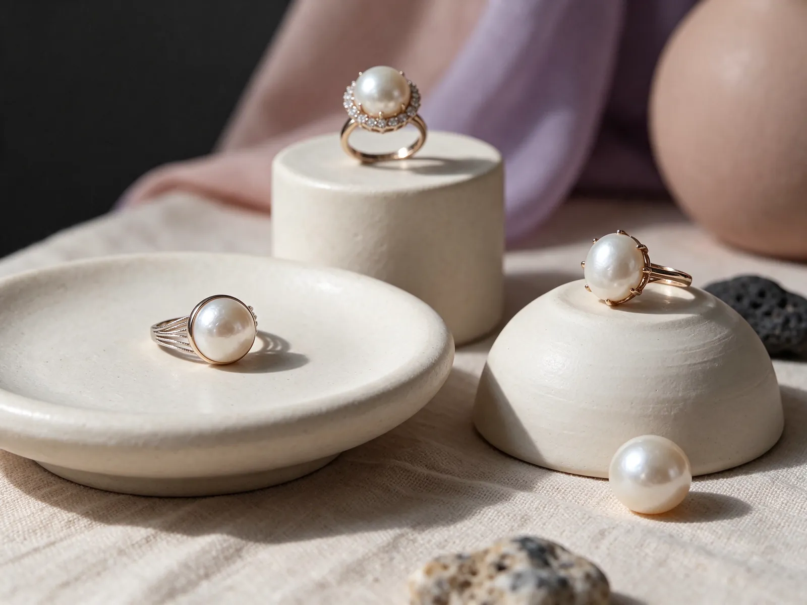
Evaluate the pearl as a whole, not one attractive detail
Move the ring to see how reflections behave across the pearl. An isolated bright point is not the same as observing the clarity and brightness of its overall luster. For surface appearance, look at where any visible texture or irregularity sits. A central feature and a feature near the setting may have different effects on the view you enjoy. Ask for a clear explanation of positions rather than letting a broad grade label replace observation.
GIA's seven pearl value factors are size, shape, color, luster, surface quality, nacre quality and matching in multi-pearl jewelry. The framework keeps the conversation balanced: one appealing characteristic does not answer every quality question. If the ring is intended to coordinate with pearl earrings, matching becomes relevant to that combination. When choosing a single-pearl ring, give particular attention to the individual pearl and the way the setting presents it.
Keep visual preferences separate from documentation
Make one list for the look you like and another for information about the particular pearl. The first might describe a dark tone and a clean outline; the second concerns identity descriptions, any treatment information and documents. A shape preference is not proof of identity. This separation lets you ask focused questions without confusing a styling impression with a verified characteristic.
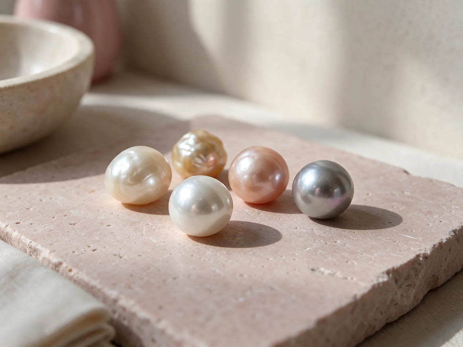
Balance metal tone, decorative detail and side profile
Think about whether the metal should reinforce a cool-looking outline or add warm contrast. Put the pearl beside the accessories you already wear rather than choosing a metal in isolation. Flint Jewelry's material discussion options are 18K 750 white gold, 18K 750 yellow gold, 18K 750 rose gold, PT950 platinum and PT900 platinum. Consider the visual finish and width of the band with the color; the entire setting frames the pearl.
Decorative shoulders can change where the eye goes. If you want a dark pearl alongside a sparkling surround, the pavé pearl ring guide offers a related direction for comparison. Decide whether decoration should remain secondary or share the focus. Also inspect the side profile and edges, because an attractive front view may not explain how the ring interacts with sleeves and neighboring fingers.
Try your usual cuff movement
Let a cuff or knit sleeve move over the back of the hand as it normally would. If you repeatedly catch the fabric or alter your gesture, record that before deciding. A lower setting is not automatically free from contact: the location of an edge or decorative element also matters. Use what happens during the movement as your guide to comfort.
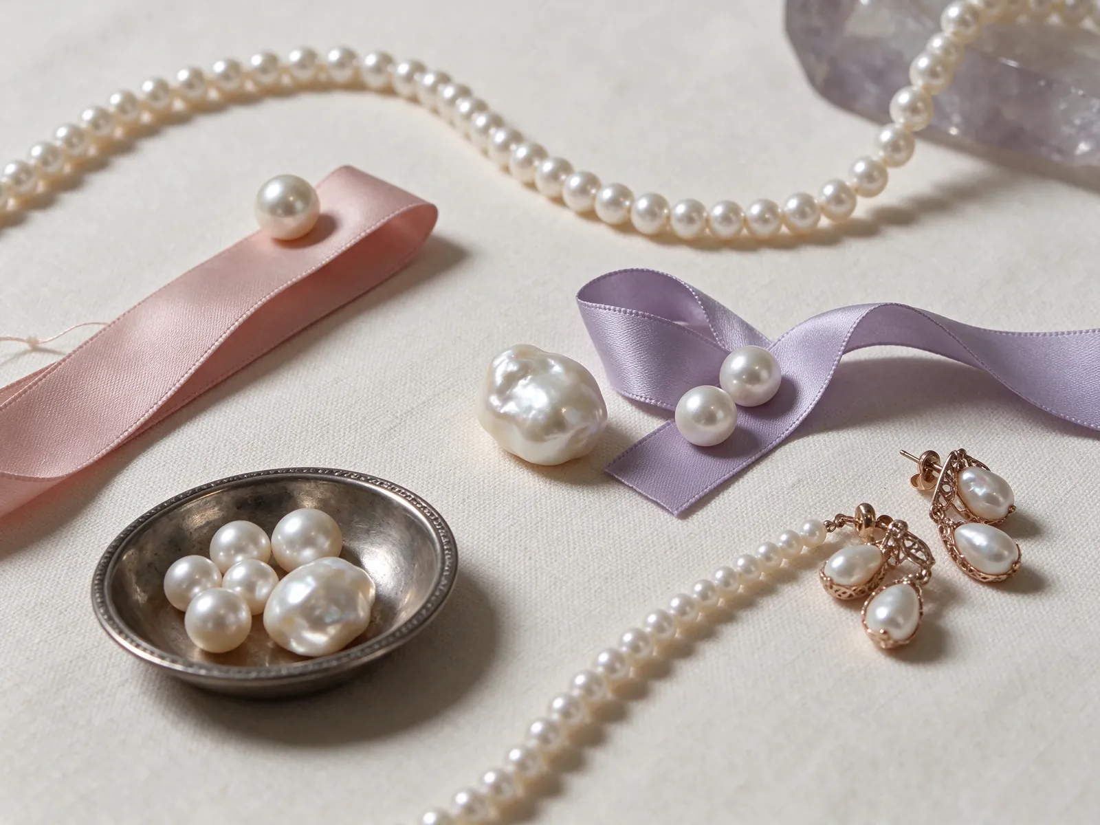
Compare ring styles with one familiar outfit
Use a shirt, jacket or dress that represents the way you actually dress. Keeping the outfit fixed makes it easier to tell whether you like the ring itself or the styling around it. If a dark focal point feels stronger than you want, compare the priorities in the South Sea pearl ring guide. The purpose is to clarify lightness, contrast and outline, not to rank pearl categories as universally better or worse.
The freshwater pearl ring and Akoya pearl ring guides provide further ways to organize preferences. Ask the same practical questions of each direction: how rounded is the outline you like, how much band should remain visible, and what other jewelry will you wear? A category name does not specify the dimensions, price or grade of an individual ring. Keep those details tied to the particular piece under discussion.
Look beyond the close-up
View your hand beside your body and against the outfit, then look more closely. A watch or patterned sleeve can compete with a ring that seemed understated in isolation. If the ring is for occasional wear, compare it with that occasion's fabric and cuff shape. This gives your choice a realistic context without assuming that one dramatic photograph represents every wearing situation.
Let shape and stacking leave room for movement
A regular rounded shape offers one kind of focus; an asymmetric outline can bring changing views as your hand moves. Explore the baroque pearl ring guide if that variation appeals to you. Consider whether you enjoy the ring from the angles you normally see, rather than deciding that symmetry must always be the goal. Shape and setting should work as a composition that matches your preference.
For stacking, check where a companion ring's edges and decorations sit relative to the pearl. A delicate-looking band can still press against it. Test relaxed and bent fingers and notice whether the rings push each other, crowd the finger base or make the main ring turn. If contact occurs, move the companion to another finger or hand rather than forcing the tightly aligned look of a display photograph.
Build the combination gradually
Try the pearl ring by itself first, then add one companion at a time. Repeat the same movements so you can identify which addition changes comfort or causes contact. Check spacing between neighboring fingers as well as along one finger. A combination that looks balanced while still may feel quite different when you pick up a phone or close your hand.
Plan care around an active hand
A ring meets surfaces and products that other jewelry may avoid. GIA places pearl at 2.5 on the Mohs hardness scale and advises never using ultrasonic or steam cleaners. Avoid acids, perfume, hair spray and excessive heat, and remove the ring for tasks involving cleaning products or likely knocks. Its dark color should not be read as greater resistance to scratching, and the setting cannot prevent every impact.
Gently wipe the pearl with a very soft, clean cloth after wearing and keep it apart from pieces that could rub against it in storage. If you notice an unusual fixing or a change that concerns you, do not twist the pearl or scrape at it with a tool; ask a professional to inspect it. When discussing style and fit, explain your usual activities as well as the color and outline you prefer.
Decide where the ring goes when you take it off
Frequent handwashing or handling personal-care products may mean removing the ring during your day. Choose a secure place in advance rather than leaving it at a sink edge. Tell the person discussing fit with you how often you expect to remove it and when you plan to wear it. Practical handling and visual preference deserve consideration together. Contact Flint Jewelry on WhatsApp at +85260106207 to discuss your preferred color contrast, setting outline and ring fit.
| Decision | Face-up check | Movement check | Wardrobe check | Useful note |
|---|---|---|---|---|
| Color | Darkness and warm or cool impression | Surface color as the ring turns | Contrast against skin and fabric | Gentle or bold contrast |
| Luster and surface | Reflection clarity and noticeable texture | Appearance at different angles | Effect at close viewing distance | Your visual priorities |
| Setting | Pearl-to-band balance | Height, shoulders and edges | Balance with existing accessories | Restrained or fuller outline |
| Band fit | How it sits at the finger base | Bending fingers and using a phone | Expected daily activities | Pinching, slipping or adjustment |
| Companion rings | Space in the arrangement | Pressure or contact with the pearl | One hand or two | Solo wear or a comfortable combination |
Pearl knowledge and authoritative references
GIA gives pearl a Mohs hardness of 2.5 and says never to use ultrasonic or steam cleaners; these are relevant care considerations when choosing a ring for an active hand.
Read the reference for this factFrequently asked questions
What should I do if the pearl looks different indoors?
Compare it in the lighting where you expect to wear it and keep the background consistent. Note whether the difference changes your preference for contrast or warmth. Do not assume a single bright photograph is a complete record of the pearl's color.
Does a bold Tahitian pearl ring need a wide band?
No. A slim band can make a dark center feel prominent, while a wider band makes the setting more visible. Look at both the front and side on your own hand and choose the relationship between pearl and metal that you enjoy.
Can a grade label replace checking the pearl's surface?
No. Observe the surface and ask where visible features are located. Consider the full set of pearl value factors rather than assuming that a label or one attractive detail explains the pearl. Keep identity and document questions separate from visual preferences.
How do I know if a companion band is safe to stack visually and physically?
Check it on the hand, not only beside the ring on a display. Bend and relax your fingers to see whether an edge presses against the pearl or the rings push each other. If contact occurs, rearrange the pieces or wear them separately rather than maintaining a crowded layout.
Is a dark pearl ring suitable for leaving on during cleaning tasks?
Plan to remove it before contact with cleaning products or activities likely to knock the pearl. GIA advises avoiding acids and never using ultrasonic or steam cleaners. A dark appearance does not make the pearl resistant to scratches or chemical exposure.
Updated: