
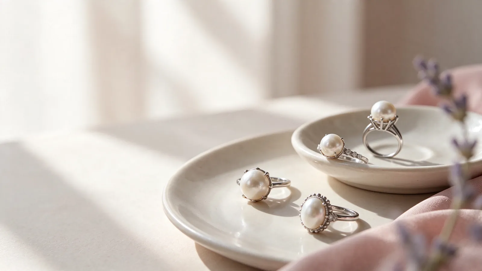
How do pearl spacing and proportions shape a multi pearl ring, from a double pearl ring to a triple pearl ring?
Think of the ring face as an outline before counting its pearls. A double pearl ring may separate attention between two points, while a triple pearl ring can establish a middle and two supporting ends. The effect depends on spacing, individual pearl size and the angle of the setting. Hold your hand in a relaxed position and ask whether the outline looks concentrated, stretched across the finger or directed along it.
Avoid assigning a fixed arrangement to a hand shape. Shorter fingers can carry an open, angled composition, and longer fingers do not automatically need a broad horizontal row. When comparing pearl rings, use a pearl solitaire ring as a visual control: does one focal point feel sufficient, or do you prefer the rhythm of several? This helps separate an interest in multiple pearls from a preference for a substantial ring face.
When trying on a multi pearl ring, what should you check about face width and finger movement in a double pearl ring or a triple pearl ring?
Watch the ring as you straighten your fingers, form a loose fist and pick up a familiar object. The outer pearls should not require you to hold neighboring fingers unnaturally apart. Inspect the underside and side view for contact at the finger base. Front-facing gaps can look generous while the settings beneath them occupy more space, so appearance from above is only part of the fitting.
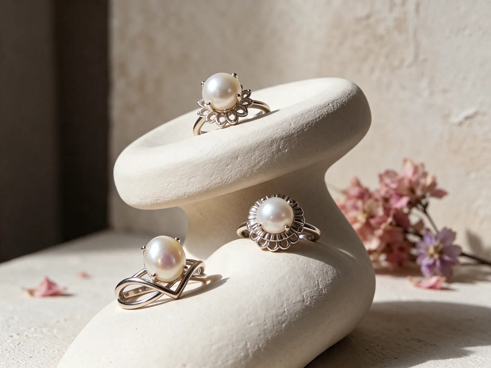
Choose the arrangement's direction before deciding on a pearl count
A paired layout can feel balanced when both ends have similar visual weight, or more dynamic when one pearl is larger or positioned higher. Trace the metalwork with your eyes to see how it connects the two points. Pearls on opposite ends of an open pearl ring may emphasize the gap, but that shape does not prove the band is adjustable. Do not squeeze or pull an opening without guidance for the specific structure.
For a three-pearl composition, decide whether you want a clear center or an even sequence. Check whether the middle seems crowded and whether the ends follow the finger's curve. The same questions apply to a longer row. A higher count does not necessarily create more width: pearl sizes, gaps and an angled orientation can make one arrangement more compact than another with fewer pearls.
Use whole-hand images to compare scale fairly
Record alternatives on the same finger with a similar camera angle and distance. Include your hand rather than only the setting, and take a side view as well. A close perspective can exaggerate the nearest pearl or conceal the outer edge. Note the qualities you actually notice, such as a strong center, generous gaps or a raised end, instead of assuming pearl count describes the whole design.
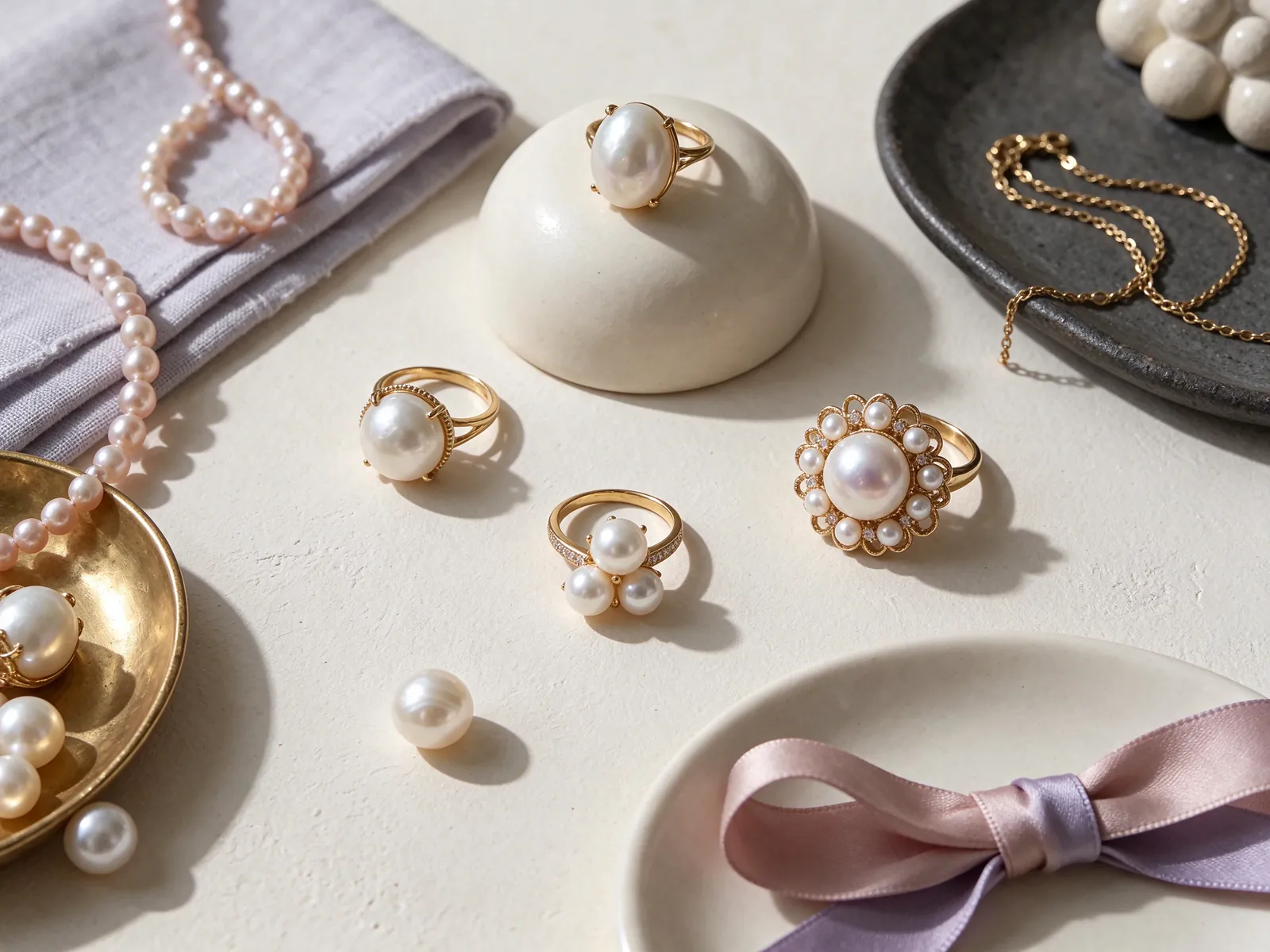
Assess matching as a composition, including intentional contrast
The relationship between pearls becomes more visible when they sit together. In an even row, a sudden change in brightness may draw attention away from the line; in a contrasting arrangement, that difference may be the intended focus. View all pearls under the same light and consider luster, color and shape together. Matching does not require identical-looking pearls in every design, but the variation should make visual sense to you.
GIA's seven pearl quality factors are size, shape, color, luster, surface quality, nacre quality and matching. This makes matching a useful part of a multi-pearl comparison without turning it into the only quality consideration. Rotate the ring gently to look at exposed surfaces and the areas beside each setting. Color or shape alone cannot establish origin, natural-versus-cultured identity or certification; keep those identification questions separate from the style you prefer.
Explain your preferred color relationship in practical language
Describe an even tone throughout, a brighter center or a deliberate difference between the ends. These requests communicate a composition rather than making assumptions about pearl type. Avoid judging from a filtered image or a single harsh reflection. Compare the arrangement with the clothes you wear most often: a quiet sequence and a contrasting focal point can suit the same wardrobe in different ways.
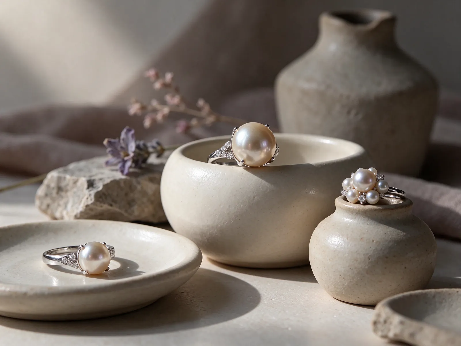
Check the setting height and the space beside your chosen finger
Face width is not the only source of interference. A high outer pearl can meet a sleeve or pocket edge, while a lower setting may still rub against an adjacent finger. Look for projecting metal on the palm side and test everyday grips using your own phone or cup. It is easier to recognize a practical obstruction through familiar movement than by imagining how a ring might feel from a photograph.
Changing fingers also changes the space around the ring. A layout that feels centered on the ring finger may rotate or become more exposed on the little finger. If that outside-hand placement appeals to you, review the considerations for a pearl pinky ring and watch the outer pearl during normal movements. A visually pleasing placement still needs suitable fit, balance and clearance from nearby objects.
Identify where contact happens rather than guessing a size change
Let your hand hang naturally, then raise it and bring the fingers together gently. Is the problem at the pearl ends, under the face or around the band? Constantly steadying the ring with your thumb hides rotation. Describe the location and movement that cause discomfort before considering a size change; an unsuitable span or profile may not be solved simply by making the band larger or smaller.
Let the ring lead your styling without crowding the pearls
Multiple pearls already introduce repetition. With detailed sleeves, leave visual space between the cuff and the ring; with a plain top or jacket, the pearl line can supply the main detail. Other jewelry does not need to repeat the same pearl count. A simpler earring outline or a quieter ring on the other hand can connect through color while keeping the multi-pearl arrangement easy to read.
When considering stackable pearl rings, compare the side profiles rather than only the view from above. Bend your fingers and check whether a neighboring metal edge touches a pearl or pushes its setting off line. A close-fitting stack can look tidy while creating unwanted contact. If space is limited, place the companion on another finger or hand instead of forcing the two outlines together.
Compare the metal tone with pieces you already wear
Use a familiar watch or frequently worn ring as a styling reference. Ask whether you want the new metal line to blend in or create a warm-cool contrast. Consider the outline and comfort alongside that color choice. A warm reflection on a pearl may come from lighting or nearby material, so neither the metal tone nor an image's color cast should be treated as evidence of pearl identity. Flint Jewelry’s customization material options are 18K 750 white gold, 18K 750 yellow gold, 18K 750 rose gold, PT950 platinum and PT900 platinum.
Protect exposed ends and clean narrow spaces gently
Wipe accessible pearl surfaces with a very soft, clean cloth after wearing. The spaces between pearls and the setting edges deserve attention, but do not pry into them with sharp tools or force a brush into a tight gap. If a pearl changes position or feels loose, stop wearing the ring and ask about an appropriate inspection. Twisting it to check attachment can put stress on the fixed area.
GIA reports a Mohs hardness of 2.5 for pearl and states that ultrasonic and steam cleaners should never be used on pearls. This is a reason to avoid scratching, not a numerical promise about impact resistance. Remove the ring before perfume, hair spray and cleaning chemicals, or tasks that press the outer pearls against hard surfaces. Keep it apart from metal edges and other jewelry during storage.
Check whether the change is on the surface or in the structure
A pearl that looks less bright may be reflecting a different angle or have residue on its surface. Compare it in consistent, gentle light first. A newly uneven gap or tilted setting is a separate observation; wiping harder is not a solution. Take front and side pictures and describe when the change appeared. Thoughtful care reduces avoidable exposure without promising that every appearance or structural issue can be restored.
Turn your preferences into a clear design conversation
Prepare a short description of the finger, arrangement direction and wearing situation you have in mind. Decide whether a paired focus, a distinct center or an even line is the priority, and whether other rings will be nearby. Include any discomfort observed while trying a comparable shape. A pearl count is only a starting point; these details explain the proportions and movement that matter to you.
Think about how the arrangement relates to the Pearl Jewelry you already wear. Does it need to echo a familiar tone or add a different outline? When contacting Flint Jewelry on WhatsApp, explain what a hand photograph or inspiration image is intended to show. Ask about the pearl information, material, ring size and setting structure being discussed rather than inferring specifications from appearance or assuming a pictured arrangement is available.
Use everyday wearability as the final deciding factor
Review the front outline, side height, neighboring-finger room, matching effect and care needs as one decision. Consider whether the design asks for a reasonable change in your habits or constant avoidance during ordinary tasks. If sleeves and phone use keep causing interference, revisit the layout. The aim is a pearl rhythm that feels like your style and works with natural movement, not the highest count or densest possible face. Contact Flint Jewelry on WhatsApp at +85260106207 to discuss your preferred arrangement and fit.
| Layout | Visual priority | Fit checkpoint | Styling consideration |
|---|---|---|---|
| Even pair | Balance between the two focal points | Outer-pearl contact with neighboring fingers | Give the pair its own space |
| Asymmetric pair | A deliberate difference in size or position | Exposure of the more prominent end | Keep nearby outlines relatively simple |
| Centered triple | A clear middle with supporting ends | Crowding beneath the middle settings | Let the center be the main detail |
| Angled triple | A line that travels along the finger | Raised points during turning and gripping | Do not hide its direction with a stack |
| Extended row | Overall span rather than count | Clearance at both ends of the row | Leave visual room beside a detailed cuff |
Pearl knowledge and authoritative references
GIA lists seven pearl quality factors: size, shape, color, luster, surface quality, nacre quality and matching. Including matching in the comparison is particularly useful when several pearls share one ring face.
Read the reference for this factFrequently asked questions
Does a multi pearl ring have to be worn as a statement piece?
No. A compact outline, restrained spacing and an even color relationship can read quietly, while wider gaps or deliberate contrast may be more prominent. Assess the arrangement on your whole hand and with your usual clothing.
What makes a triple pearl ring look center-led?
A difference in size, position or visual brightness can direct attention to the middle. Compare all three pearls under the same light and check whether the side pearls support that focus rather than crowd it.
Can I choose a larger ring size to solve rubbing between fingers?
Not automatically. Rubbing may come from the face span, pearl placement or setting profile rather than the band size. Identify the exact contact point during movement before discussing a fit or layout change.
Is a low setting automatically easier for everyday wear?
A lower profile can reduce some exposed height, but it still needs clearance beside the finger and around its settings. Test familiar grips and sleeves; height alone does not determine comfort or suitability.
What should a customization brief say beyond the number of pearls?
State your preferred direction, intended finger, central or paired focus, stacking plans and any movement restrictions you noticed. Then discuss the specific pearl information and setting structure separately from the visual reference.
Updated: